15 components redesigned, documented, and shipped across product teams.
Indigo V3 — a ground-up modernization of a design system that hadn't been touched in years. I led the component redesign, created frontend-ready specs, demoed interaction patterns, and helped teams resolve the gaps between Figma, Vue, and production.
01
THE REAL JOB
Indigo V1 & V2 were built by Accenture over a decade ago and had not been meaningfully updated since. By the time V3 started, the system had years of inconsistency built in: components looked different across products, patterns did not always match, and there was no clear foundation for teams to build from.
USAC had a small two-person UX team, supported by Accenture contractors for Vue implementation. We split component ownership clearly, and the components shown in this case study were the ones I owned end to end.
DESIGNED IT.
SPECCED IT.
SHIPPED IT.
SUPPORTED IT.
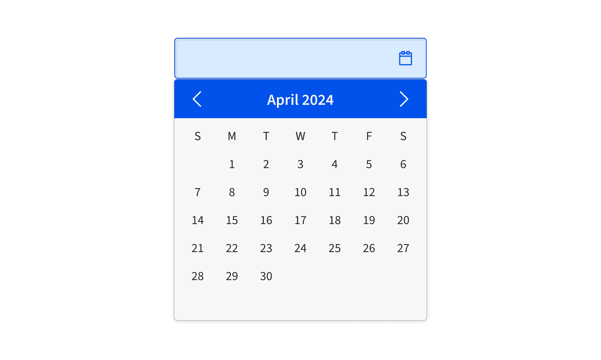
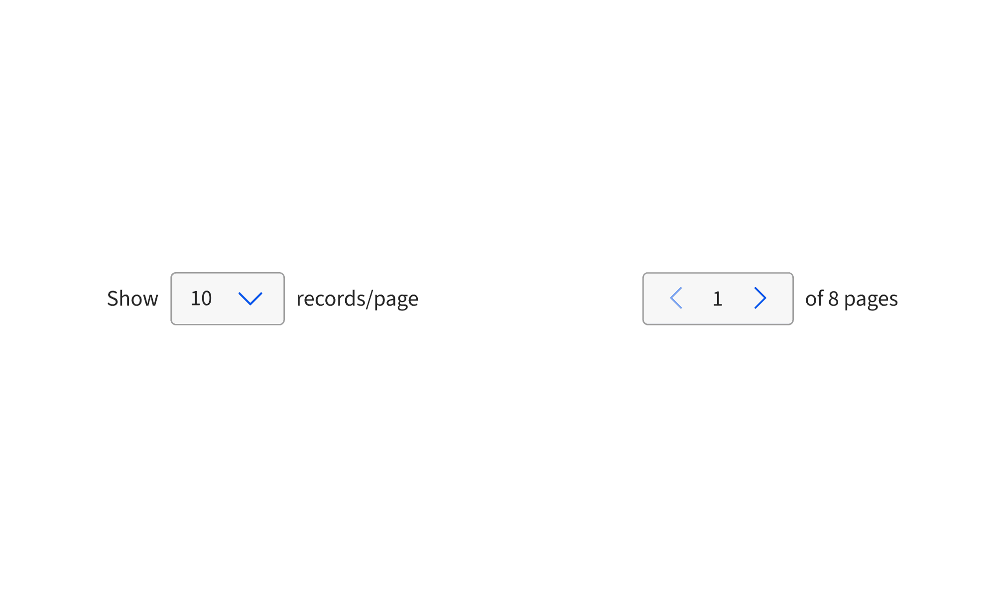
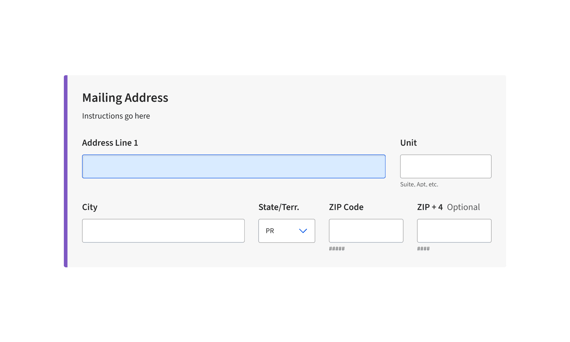
For 15+ components I ran the same process every time: Figma spec, documented states and edge cases, built a demo page showing the component in context, then sat in UAT while Accenture developers implemented it. When something didn't match — and it usually didn't on the first pass — I was the one figuring out why.
A big part of the job was translating design decisions into frontend-ready guidance. Developers came to me for CSS behavior, responsive layout questions, Vue implementation details, and component edge cases. Our UX team was only two people, so I became a de facto frontend reference for developers building an enterprise component library.
That was when the value of the work became clear: the most important part was not just designing the component, but making sure other teams could actually build and use it correctly.
02
ACCENT COLOR SYSTEM
Indigo V1 and V2 had accent colors that didn't hold up. The original orange and green were inconsistent with the primary blue and didn't pass WCAG across backgrounds. I replaced both — new orange, new teal — and added a full purple ramp that didn't exist in the previous system.
The problem wasn't picking colors that looked nice. It was finding values that passed WCAG AA on both white and black backgrounds, sat alongside the existing Indigo blue without competing with it, and didn't break contrast anywhere in the gray scale. Most candidates failed on one background or the other. The math settled it.
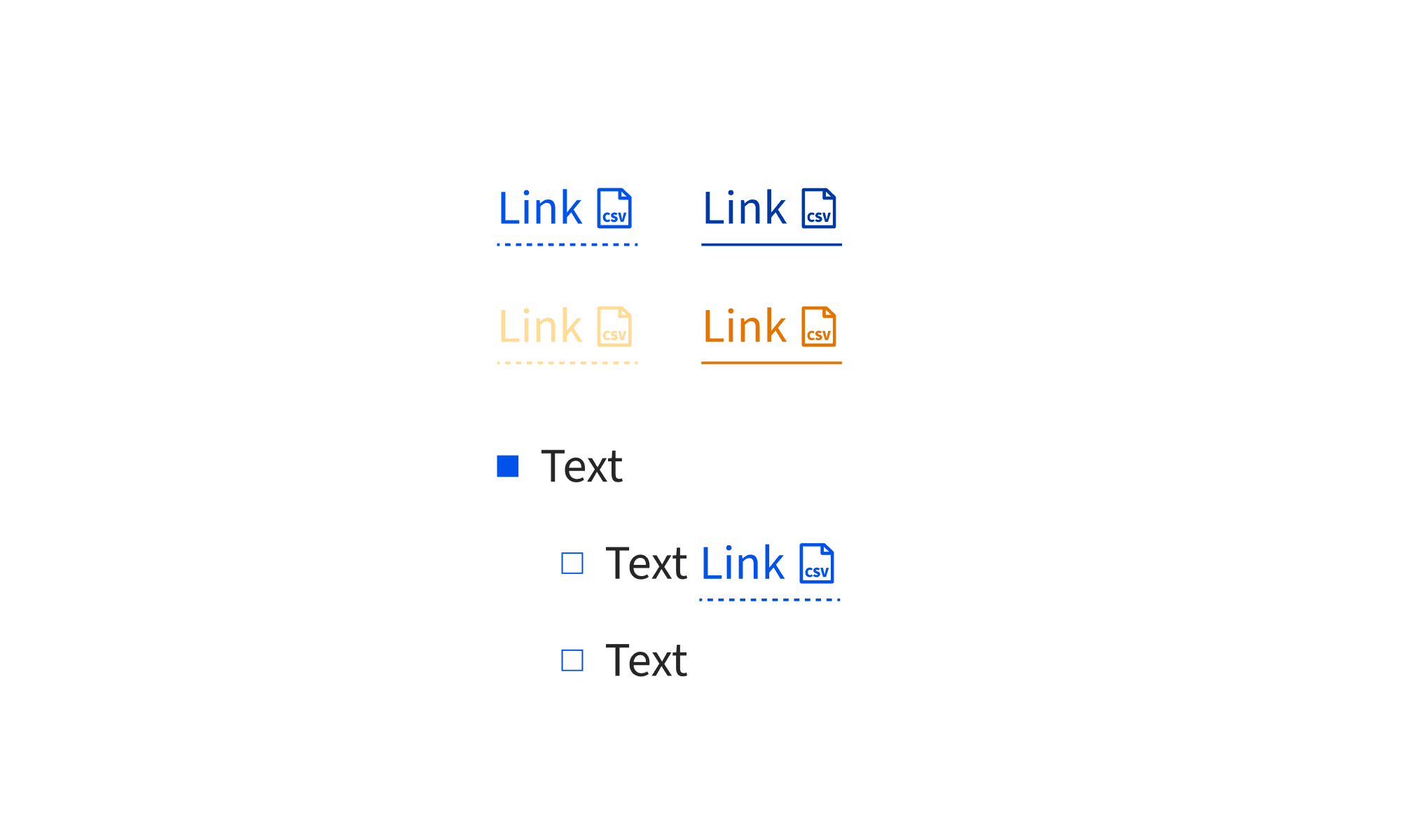
Only Purple-16 and Purple-38 for text. 61 and 84 fail normal contrast on light backgrounds.
Orange and Teal scoped to illustrations, data visualizations, and tags. Not for primary UI actions.
Always start and end with primary blue. Introduce accent only after blue is established in the layout.
WHY 38.
Purple-38 was chosen to pair with Blue-38 (#0052EB) – USAC's primary blue. Same position number, same relative weight in the scale. The accent needed to sit at the same hierarchy level as the primary, not lighter or heavier.
Once Purple-38 was the anchor, the formula defined where everything else in the ramp sits relative to it.
Same position · Same weight in the scale
NOT EYEBALLED.
DERIVED.
Every color in the ramp has a position number. Those numbers aren't arbitrary — each one is calculated by comparing the candidate color's RGB channels to the reference (Purple-38), averaging the three channel ratios into a scale factor, then multiplying by 38.
Red: 45/125 = 0.360 · Green: 37/87 = 0.425 · Blue: 67/195 = 0.344
Average: (0.360 + 0.425 + 0.344) / 3 = 0.376
Position: 0.376 × 38 = 14.3 → Purple 16
The math tells you where any color belongs. No guessing, no vibes.
Contrast ratios vs light (#FFFFFF) and dark (#000000) backgrounds.
Purple — 16
#503280
Light bg
Dark bg
Purple — 38
#7D57C3
Light bg
Dark bg
Purple — 61
#9F83D4
Light bg
Dark bg
Purple — 84
#C5B5E2
Light bg
Dark bg
Orange
#E37400
Light bg
Dark bg
Teal
#06A97C
Light bg
Dark bg
LIVE DOCUMENTATION
The usage rules in the live Indigo documentation map directly back to the WCAG contrast results. Purple 61 and 84 are restricted from text use because the contrast table shows why: 3.15:1 fails normal text on light backgrounds.
View live docs ↗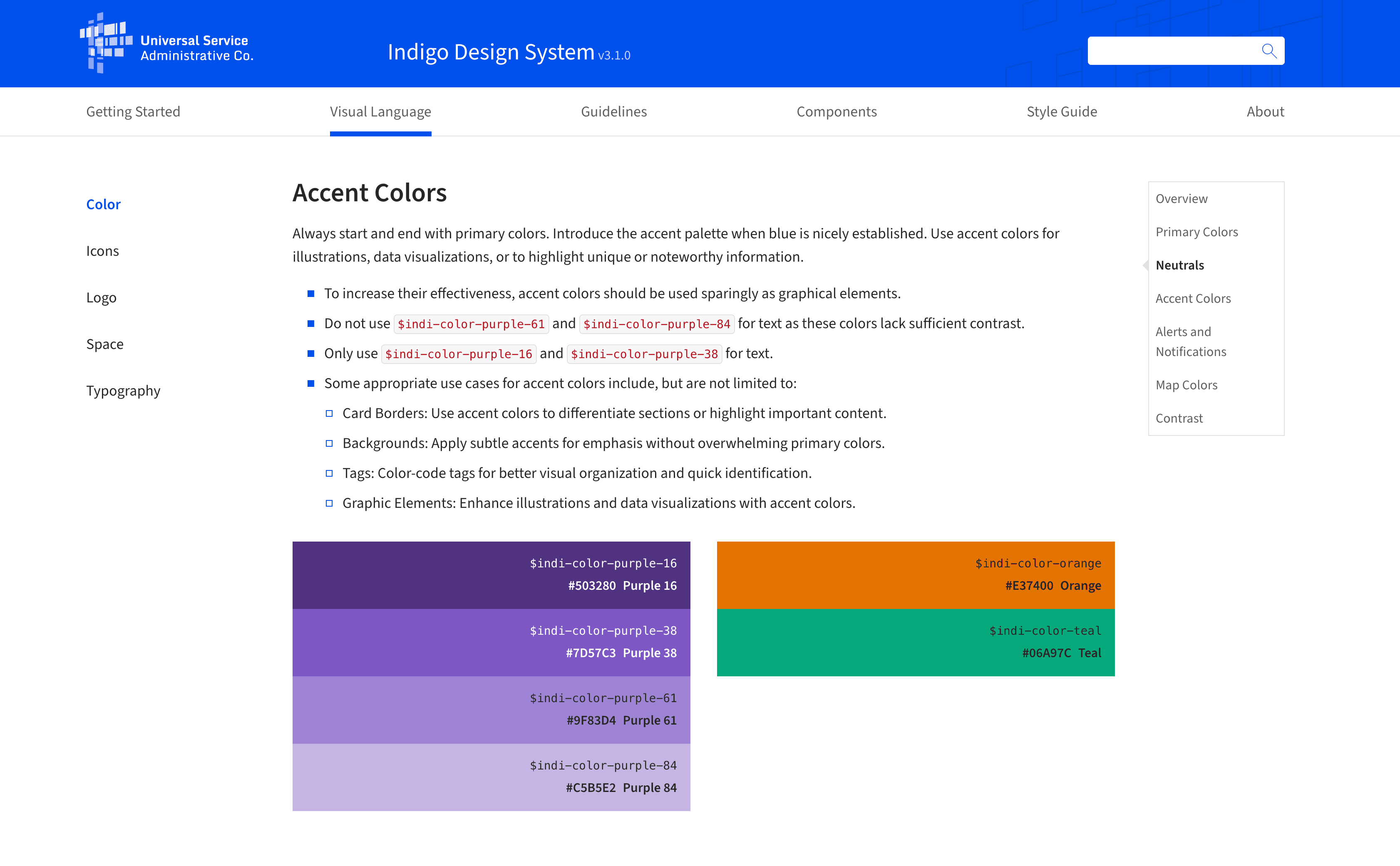
03
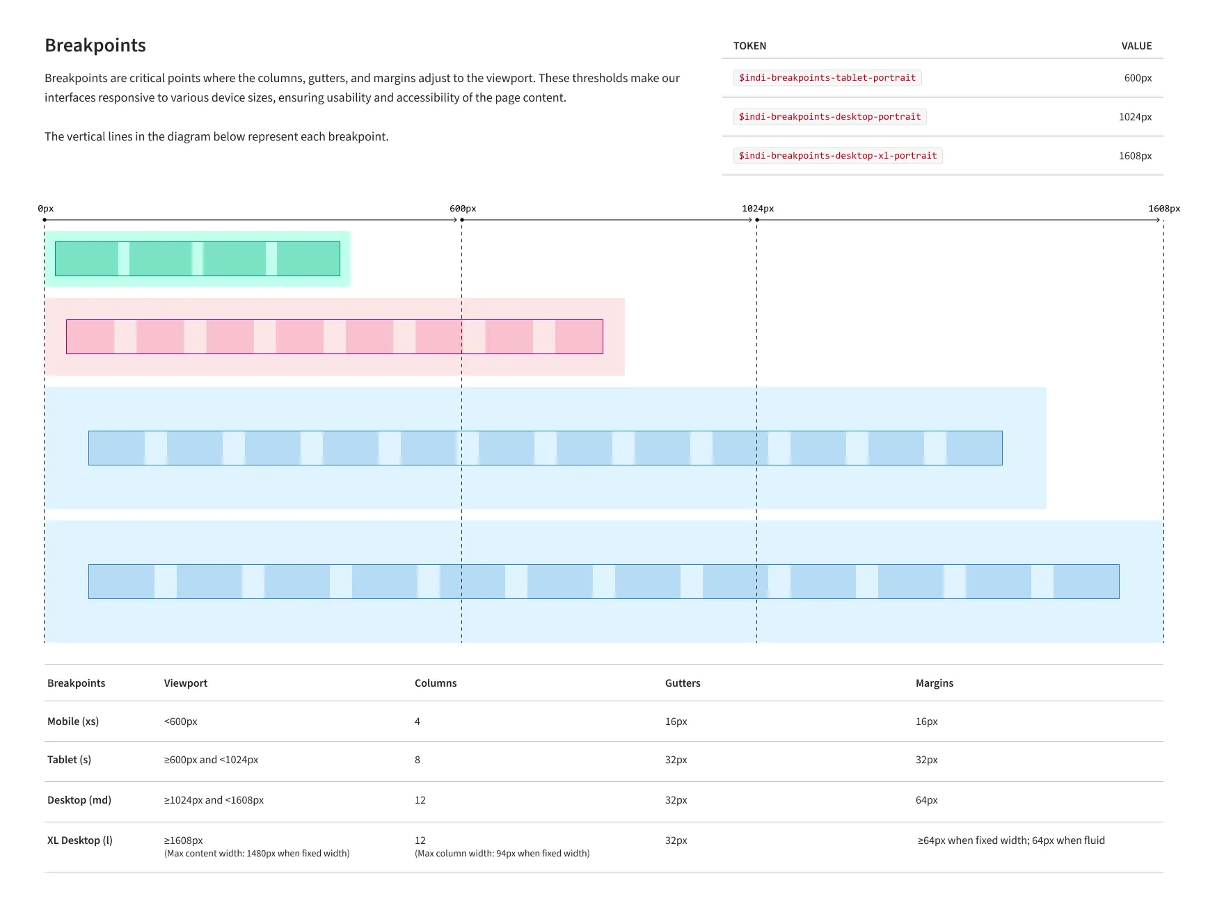
GRID
SYSTEM
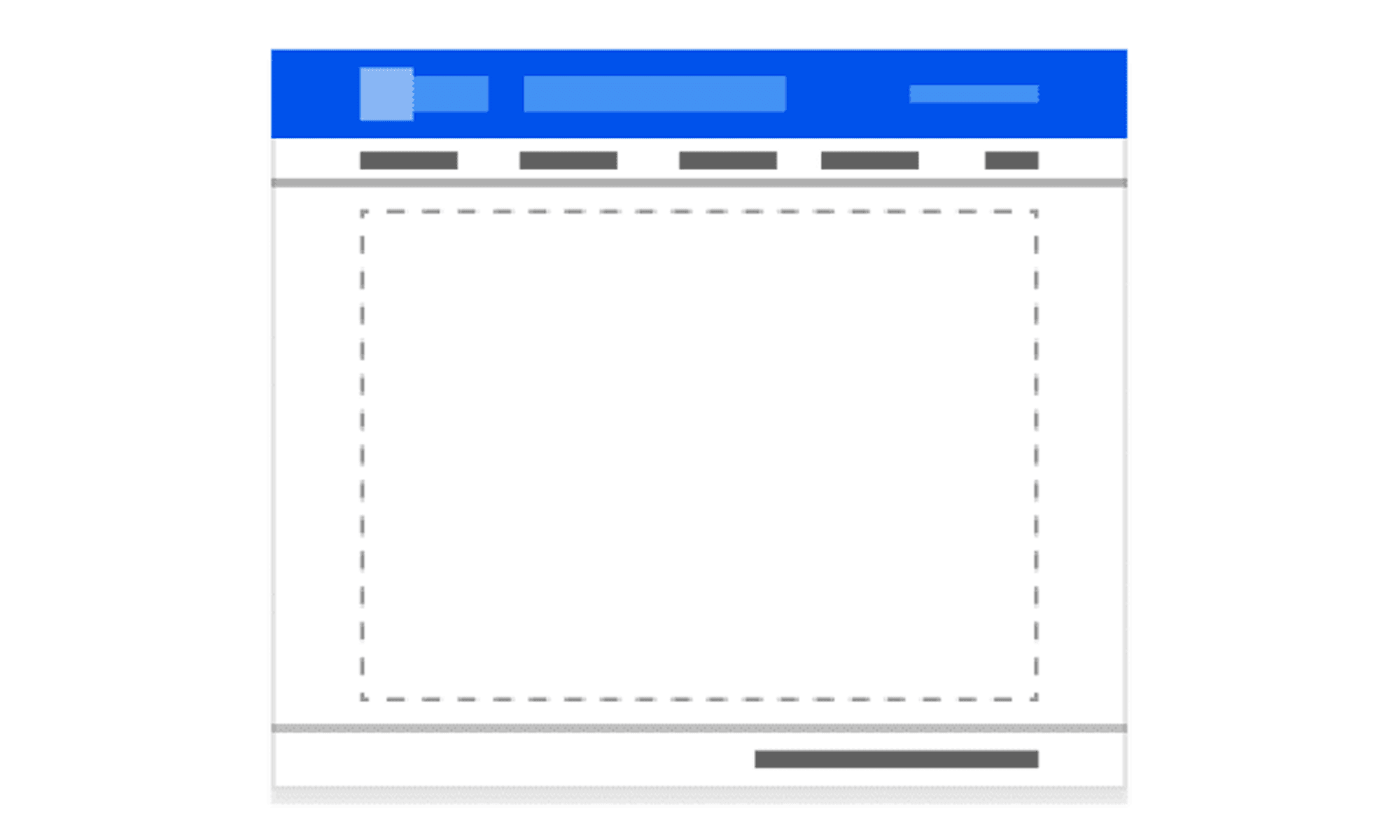
Static grid specs were not enough. The system needed to work across USAC layouts, live breakpoints, fixed-width side panels, fluid content areas, and actual product content. I built a coded Next.js prototype to test the grid in the browser before I handed it off to developers.
The prototype exposed the grid tokens at each viewport — columns, gutters, ranges, max content width, and max column width — so the rules were visible while the layout changed. Instead of handing off a theoretical grid, I handed off a tested system.
A coded Next.js prototype with live breakpoint switching, active token display, and content loaded into the page shell.

04
ICON
LIBRARY
Every icon in the library was designed from scratch — optical weight, stroke width, and recognizability at small sizes all worked out before touching a vector. Each icon followed the same process: design → critique → vector → pixel review → WCAG check → component. No exceptions, including the ones I had to redo more than once. The library shipped, was featured in the USAC Employee Spotlight on Medium, and every USAC product team built from it after that.


A 9-minute writeup on the full icon overhaul — design process, Figma setup, and the SVG bugs I found and fixed while testing in the browser before handoff. Most designers stop at export. I didn't.
05
COMPONENTS
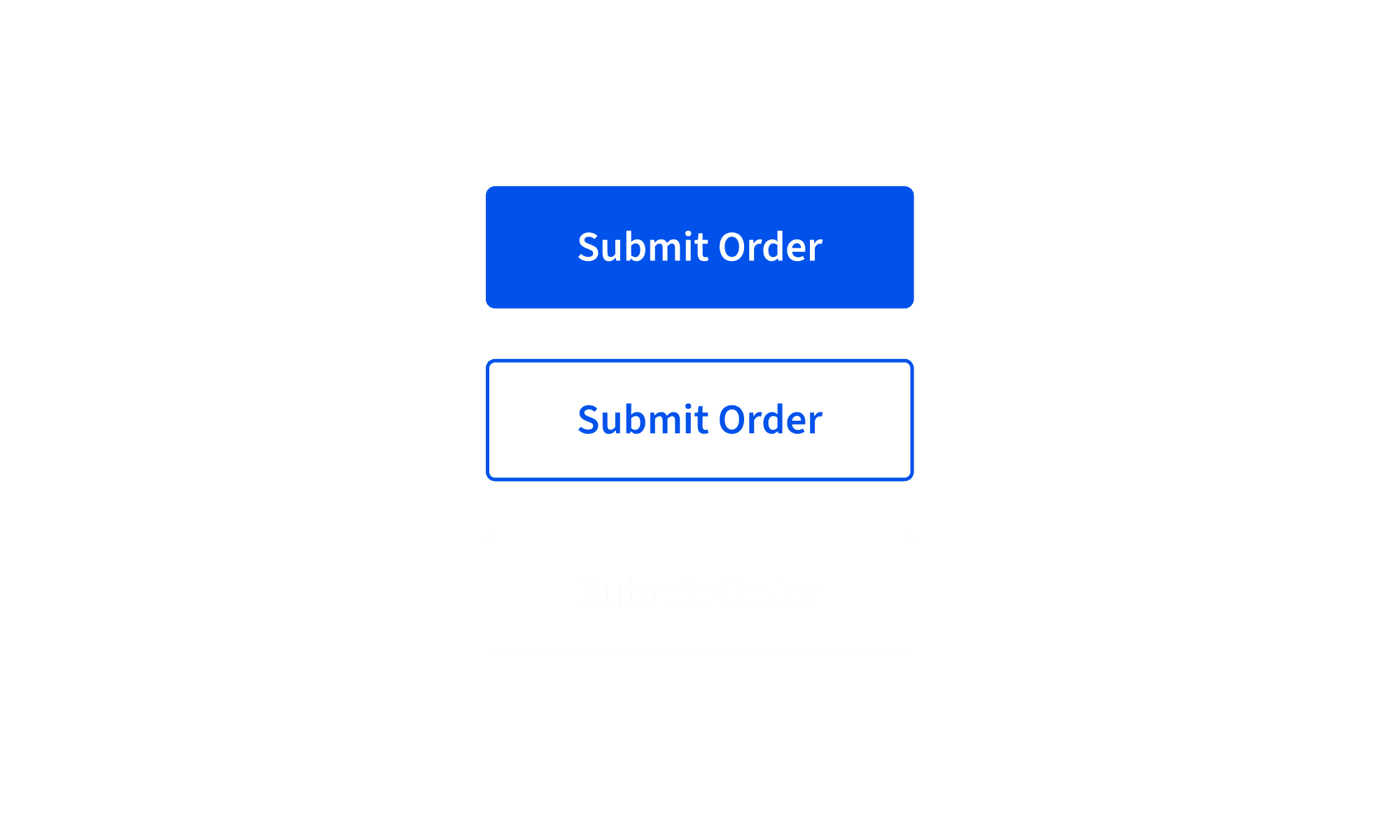
15+ components, each specified in Figma, documented with states and usage rules, demoed through coded interaction examples, and reviewed in UAT with Accenture developers. The work did not stop at design handoff. I stayed involved through implementation, tested edge cases, and helped translate design intent into working component behavior.

06
BEYOND THE
COMPONENTS
The components were the visible work. This was everything else — the things that needed doing that nobody had a job title for.
Indigo officially supported Vue.js, but many teams wanted to preview components in React. I built a React demo library using the same visual specs so developers could test component behavior without setting up a Vue environment. It gave teams a faster way to evaluate patterns, check visual accuracy, and understand how components should behave.
When AI tools started showing up in the design workflow, there was no shared standard for what was acceptable, what needed documentation, and where human review still mattered. I wrote design.md to define how our team uses AI, what gets documented, and which decisions still need a human behind them. It was later adopted as the company standard.
I ran workshops where developers built from my specs in real time. When something was unclear, I updated the Figma file and documentation on the spot. Every design decision was documented so future teams could understand why components were built the way they were. It created a faster, more honest feedback loop than waiting for issues to surface later.
The two of us kept the Figma file current with every major platform update — variables, component properties, auto layout, dev mode. The file wasn't a snapshot of the system at a point in time. It was the system, and it stayed that way.
07
OUTCOMES
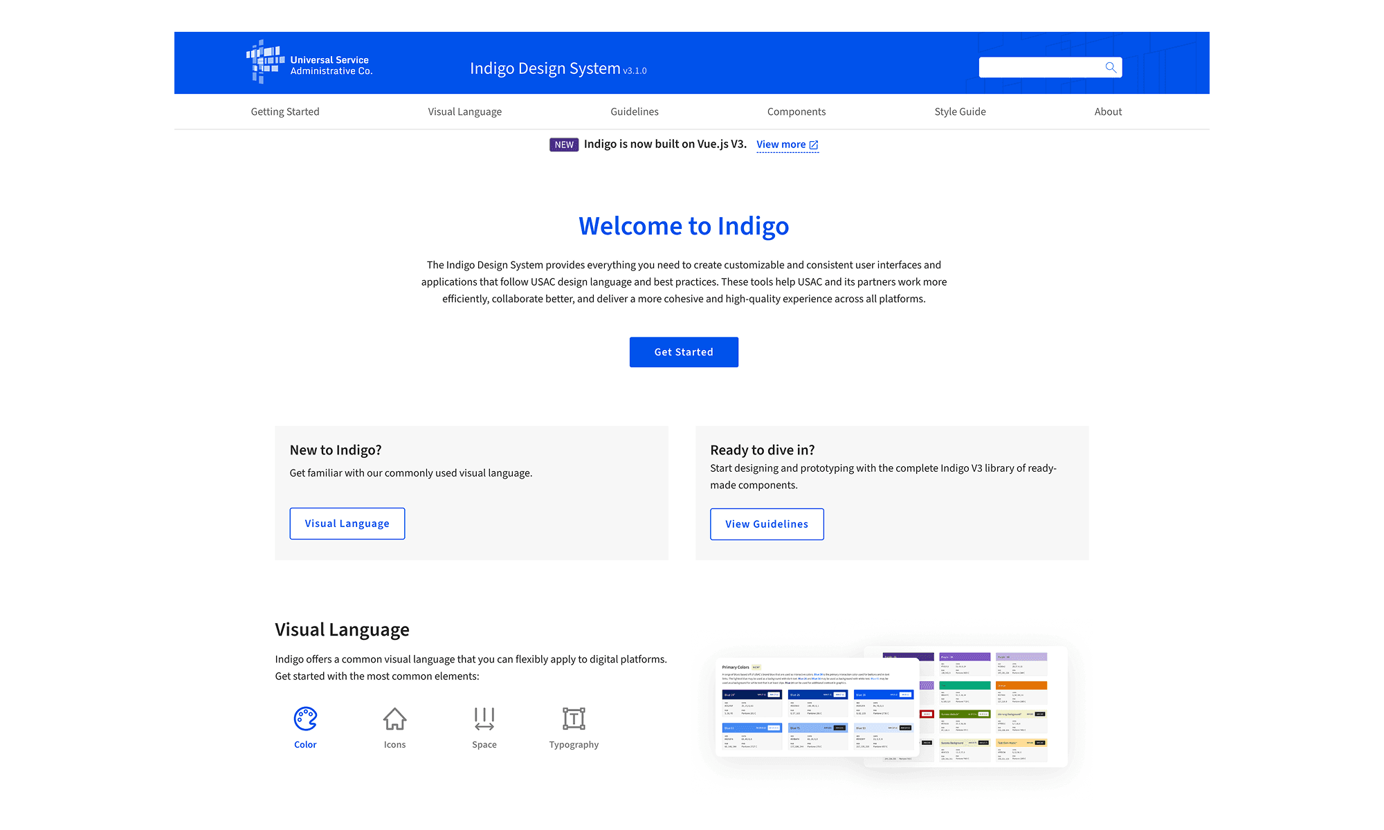
Indigo V3 is live at indigo.universalservice.org and in production across USAC's digital products. V1 was built by Accenture 8 years ago. V3 is what we replaced it with.
Each one specced, demoed, UAT'd, and iterated. From Figma to production with me in the room the whole time.
Indigo components in production across USAC products — used by students, schools, and administrators nationwide.
indigo design.md — created by me, adopted as the official AI policy for the design teams.
V1 was Accenture's, built 8 years ago, never seriously updated. V3 replaced it from the ground up.