Back to Works
CASE STUDY

Roastraft Digital Subscription Experience

Roastraft, located in Westham, made a significant investment in roasting machines. With a vision to promote their freshly roasted coffee beans and a desire to tap into a broader audience, the cafe recognized the urgent need to transition online. This digital move aimed not only to increase their sales but also to offer a convenient platform for loyal customers and attract potential customers.

Picture of the roastraft coffee shop websites
Picture of stroe front
THE Goals
THE Problem *

Lack of Digital Infrastructure: Roastraft's inability to allow customers to order or subscribe to their offerings online.
Promotion Hurdle: A need to spotlight their new location and the story behind it, facilitated by their new roasting machines.

notFound illustration
Constraints

Budget Budget limitations for design and develop teams.

Timeframe A tight deadline of three months to go live.

Accessibility Ensuring the platform is accessible to all users, considering the diverse clientele.

Market Validation

Our initial market survey identified that 77% of respondents in the area preferred ordering coffee online. Furthermore, 65% expressed interest in monthly coffee subscriptions if offered by their favorite local cafe.

illustration of survey feedback
The Process

The design journey spanned less then 3 months (10 weeks)

Project timeline illustration
Requirements & Identified Pain Points

From feedback gathered from 78 survey respondents and 10 one-on-one user interviews, the following challenges faced by users were identified in alignment with Roastraft's project goals

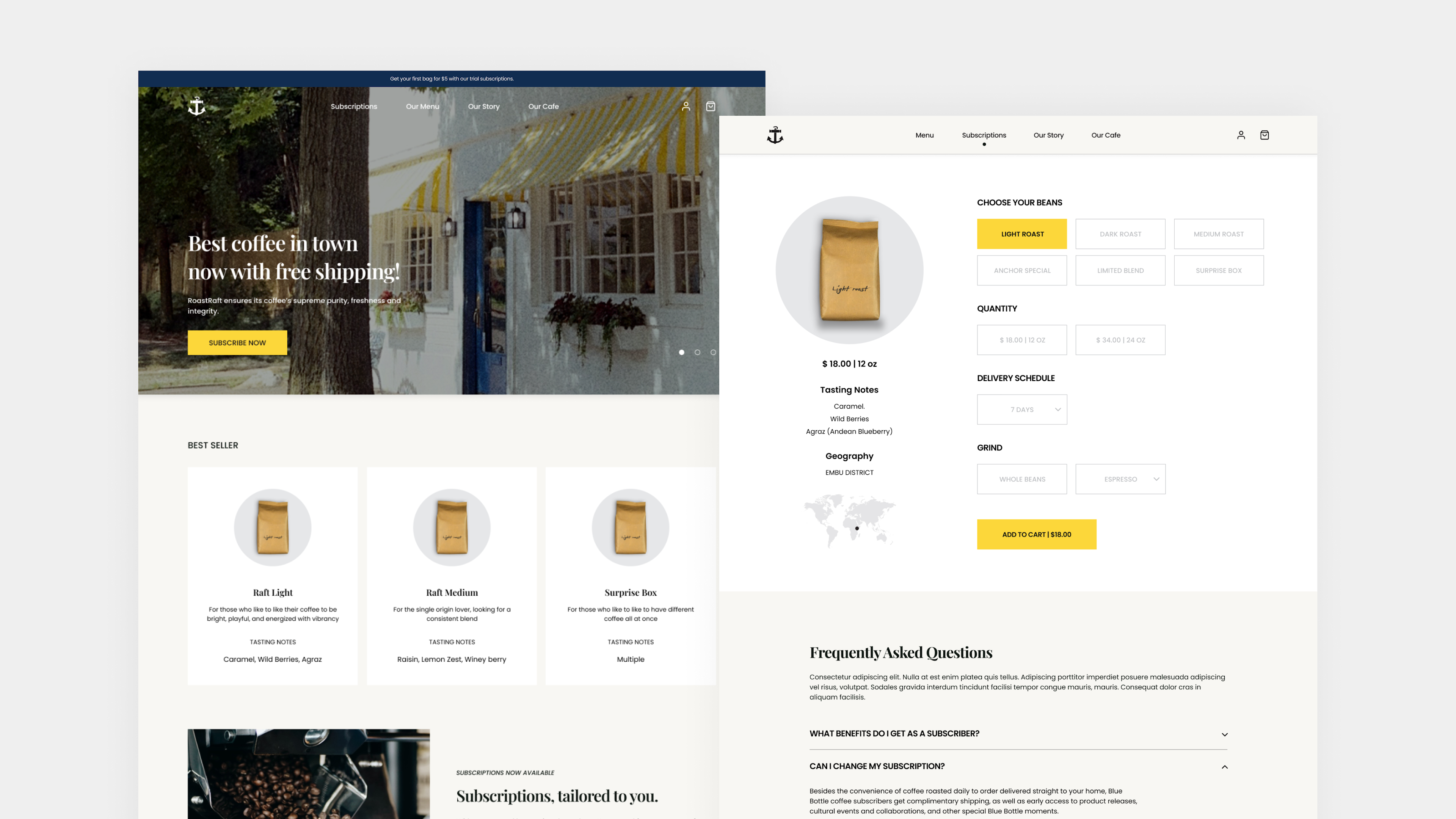
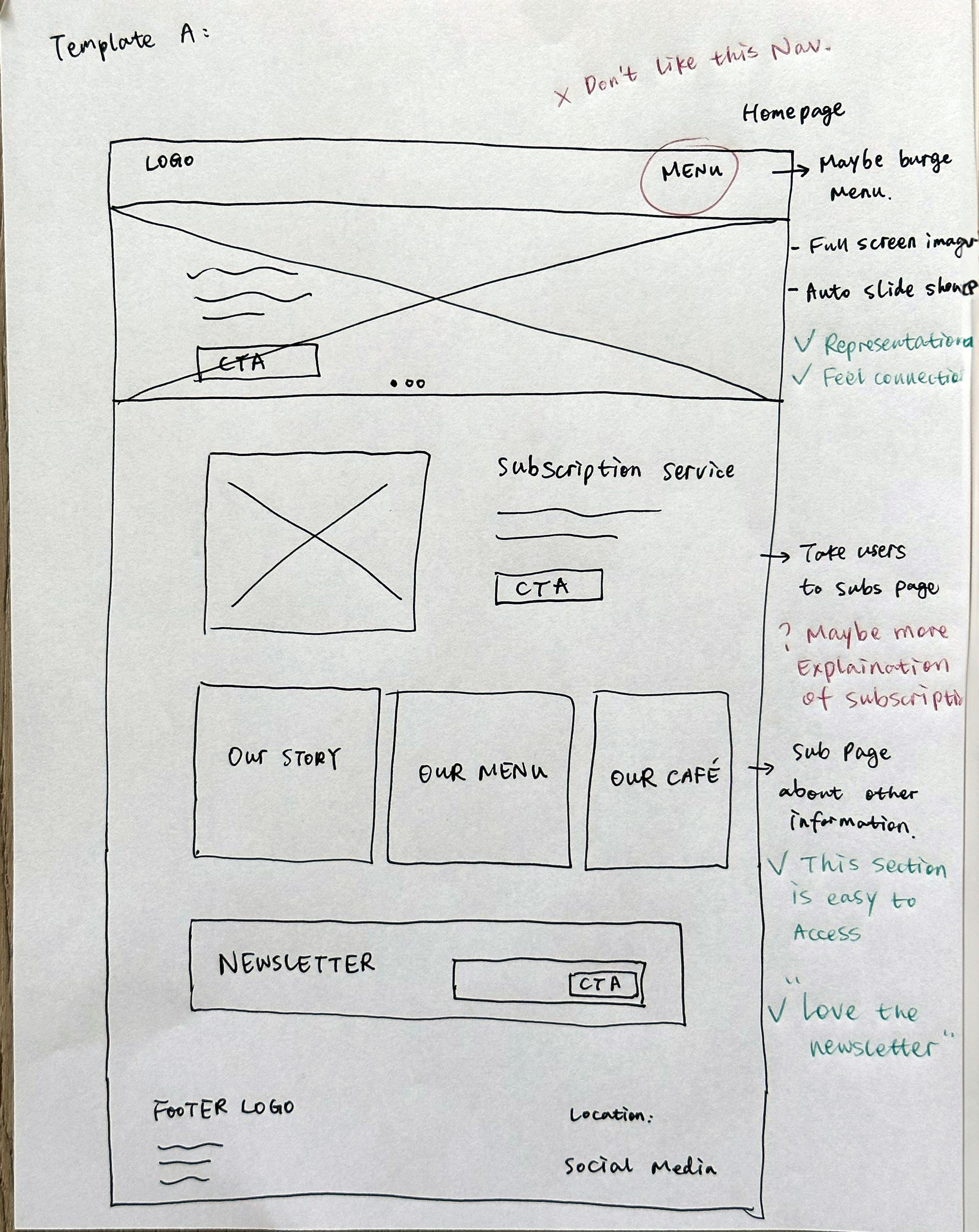
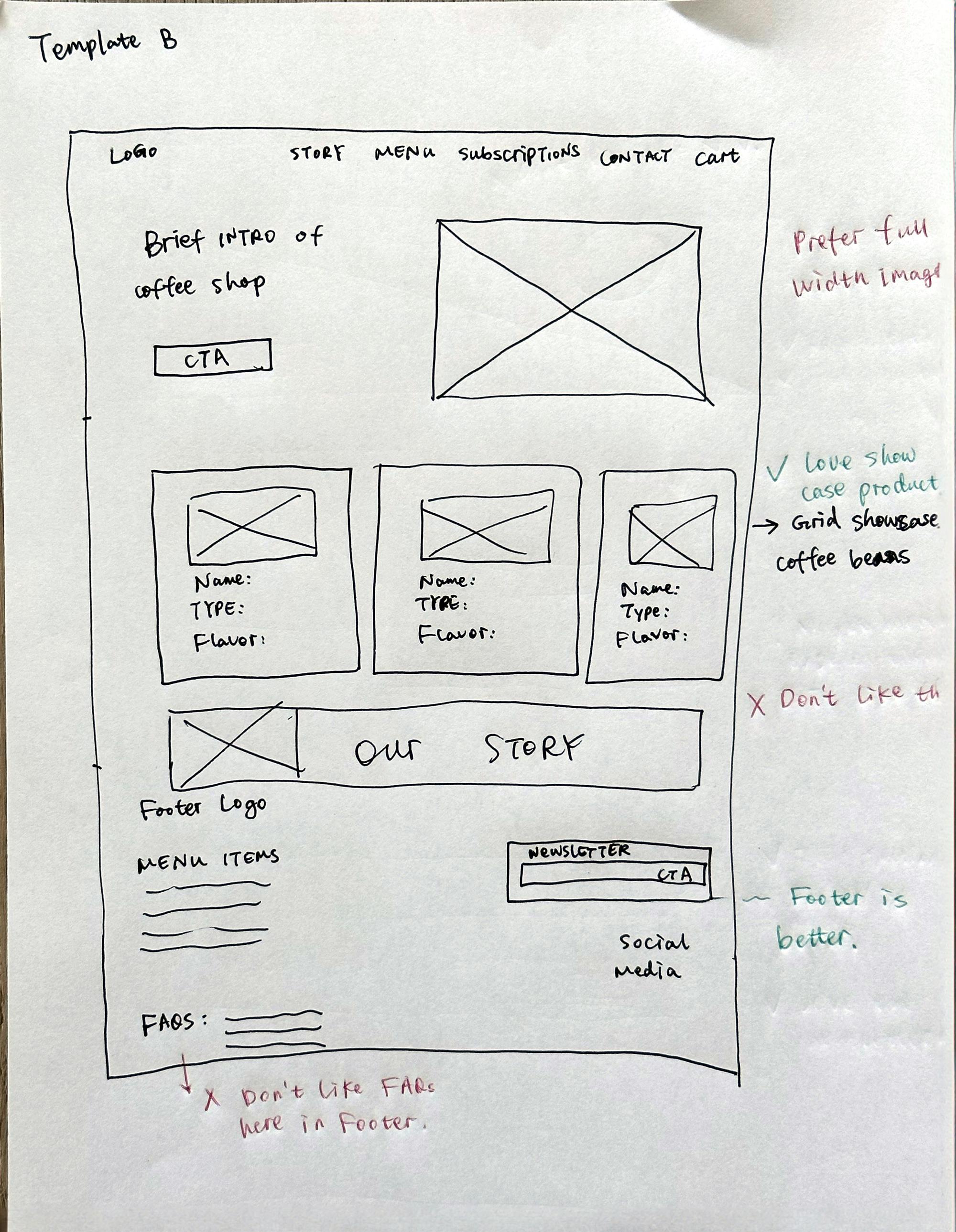
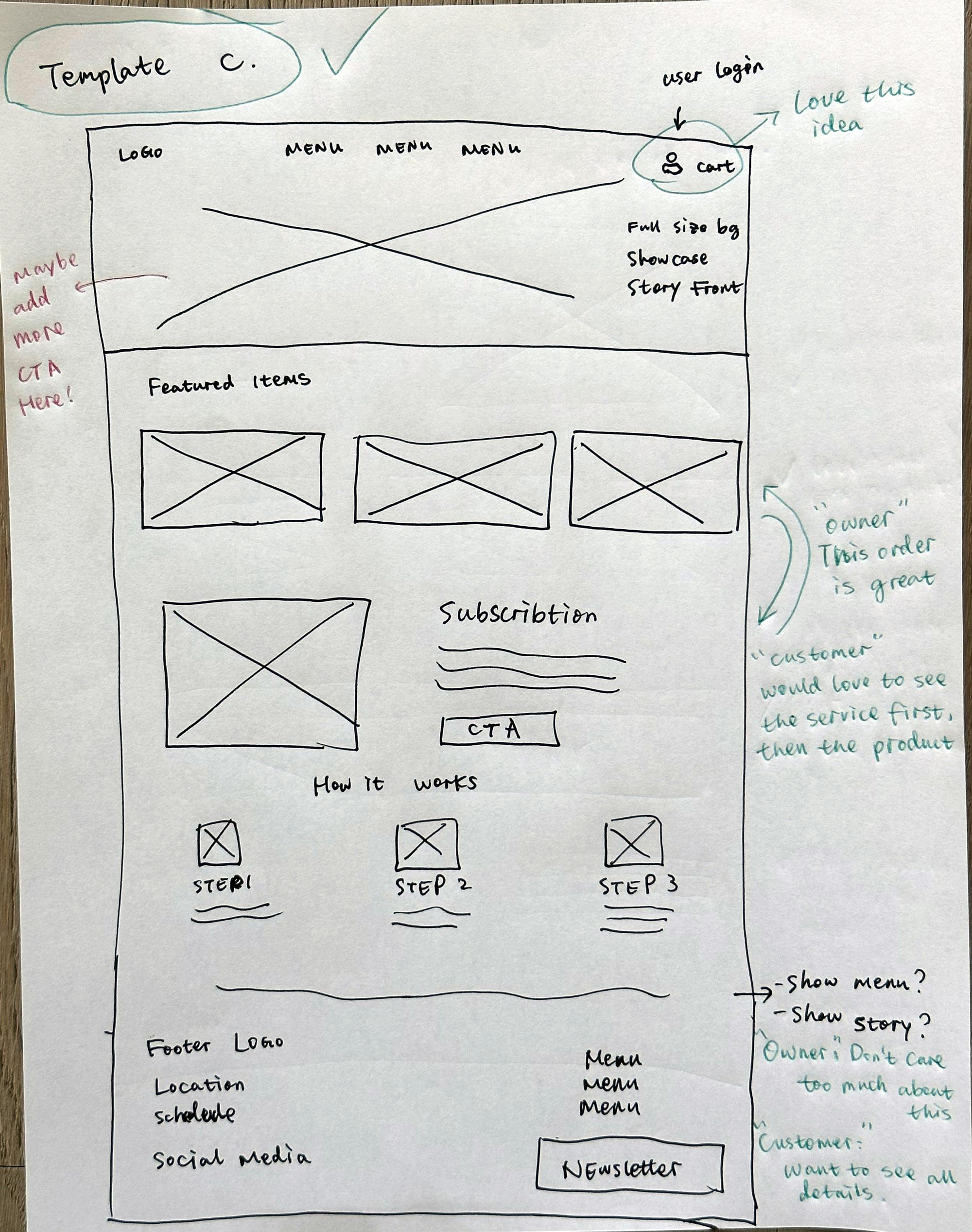
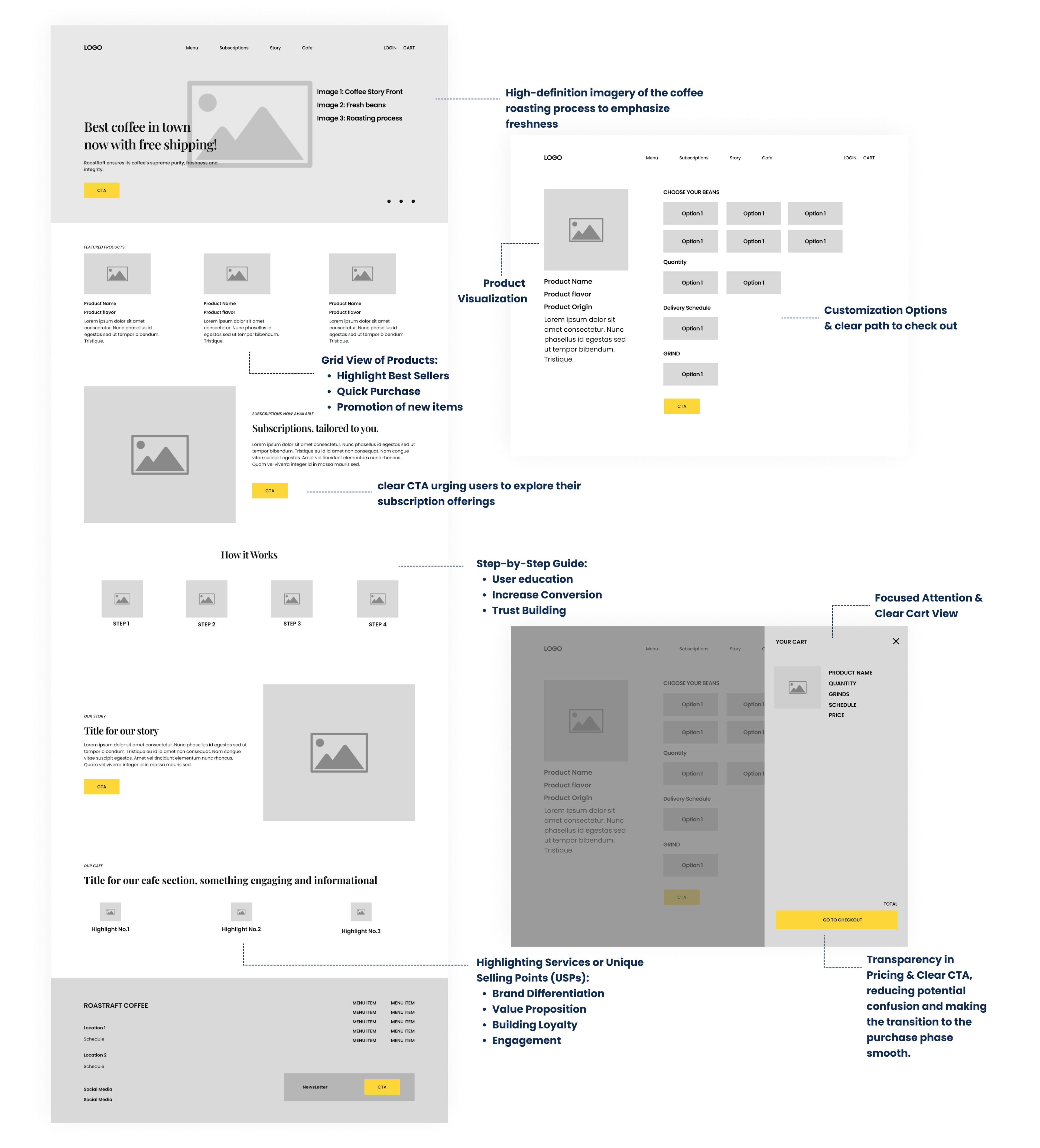
1. User Exploration & Subscription Difficulties

Many users expressed difficulty in finding local cafes that offer online subscription services. This aligns with the project's goal to develop an online platform for users to explore and subscribe to their favorite Roastraft products.

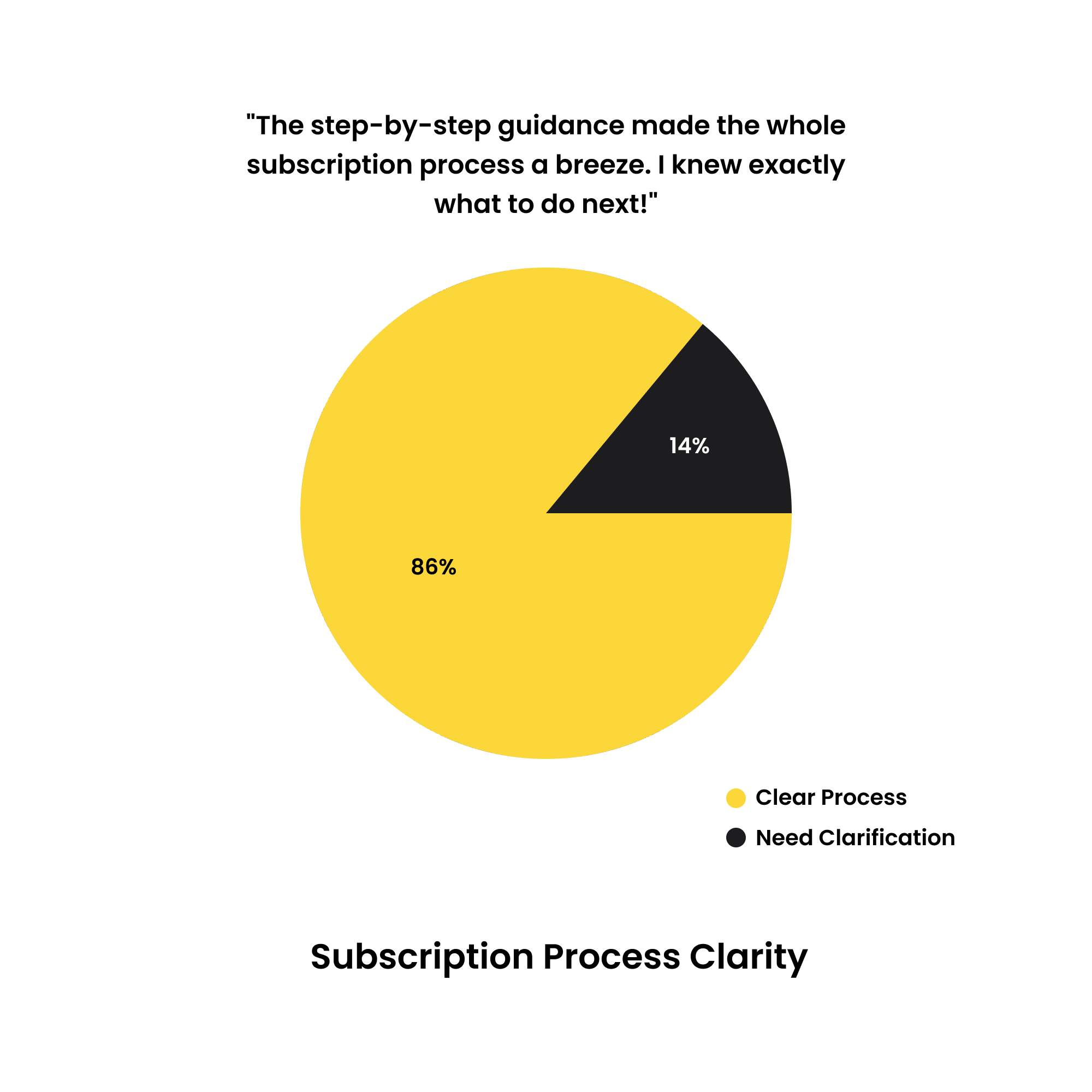
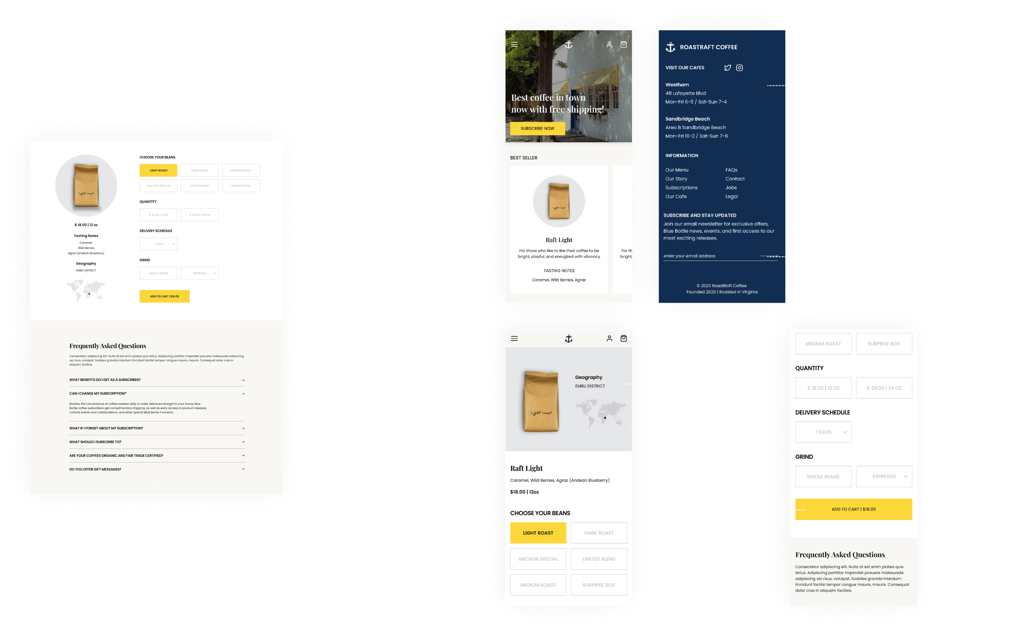
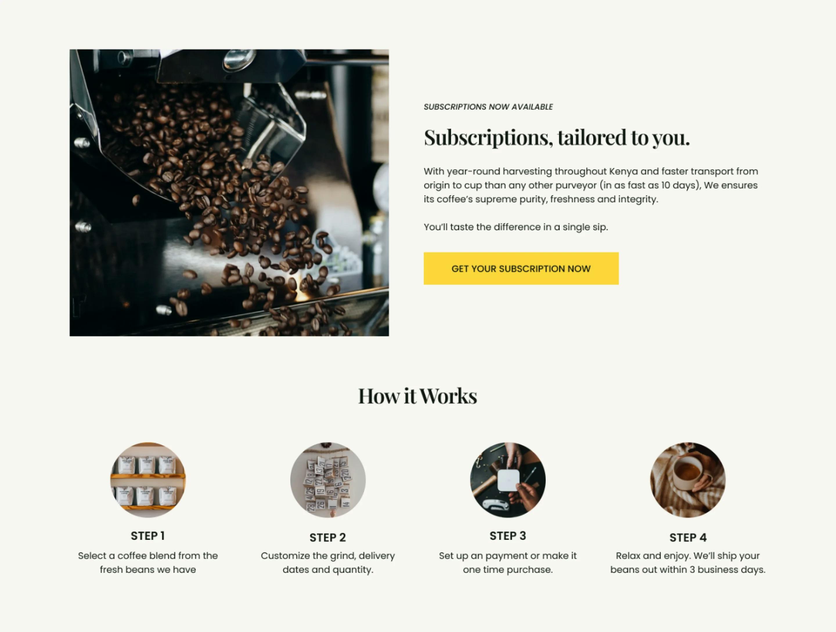
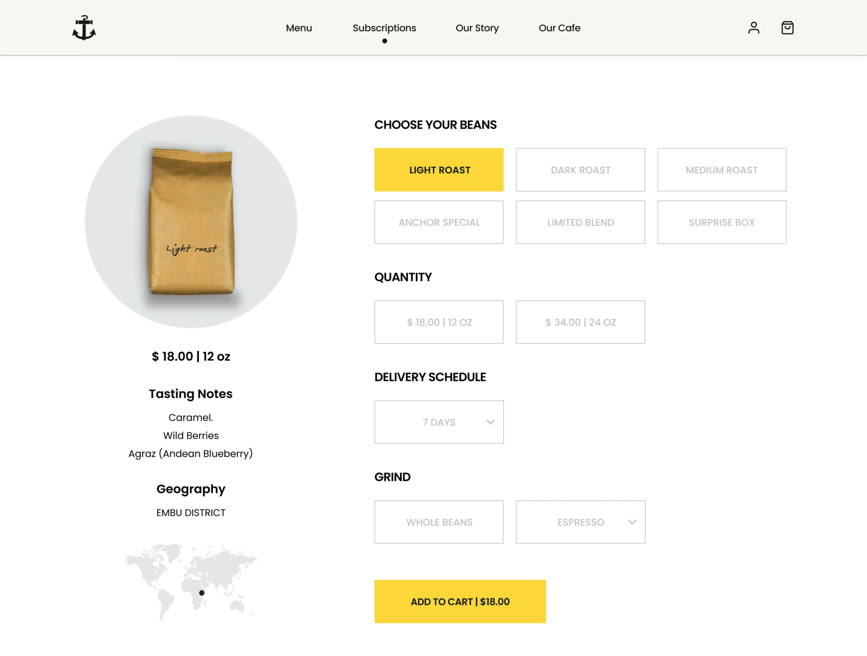
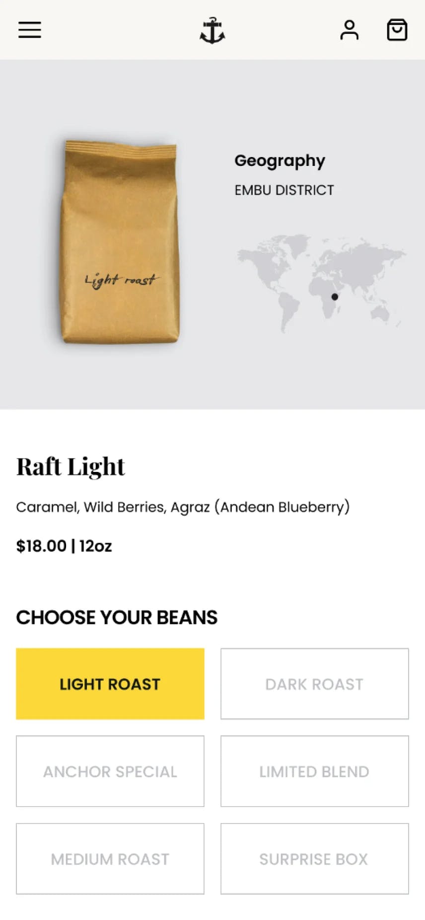
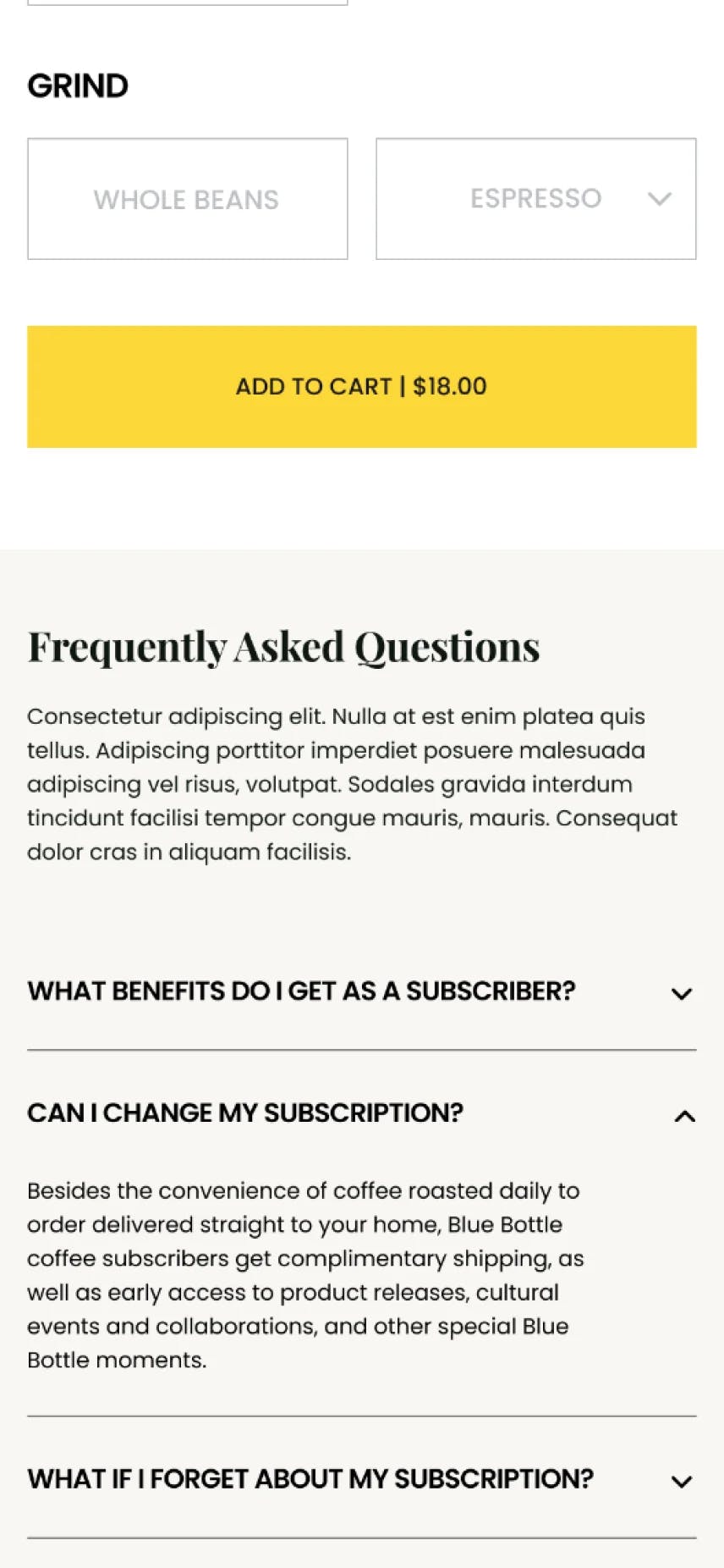
2. Complex Ordering Process

Reordering their favorite coffee or navigating through the platform wasn’t always straightforward. This insight emphasized the need to streamline the online subscription and ordering process.

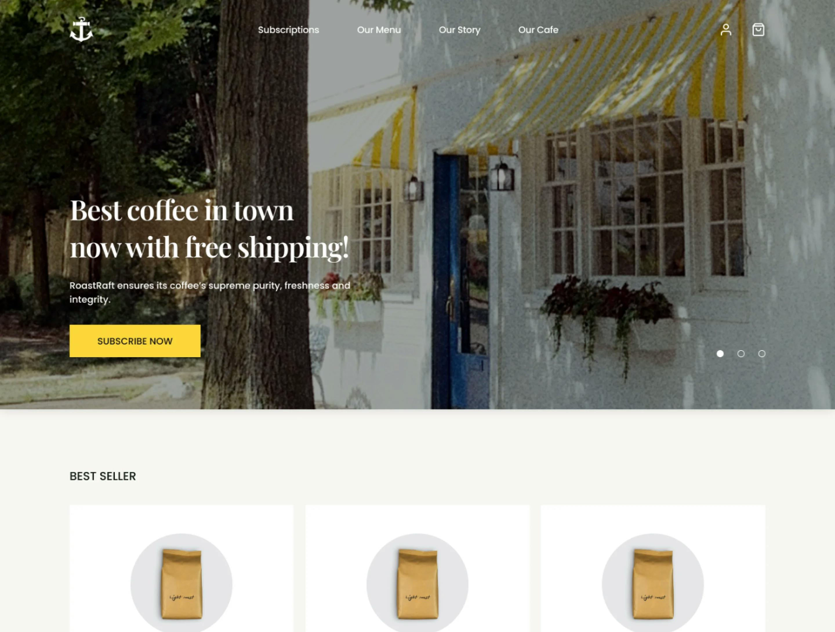
3. Inconsistent Mobile Experience

Users reported that some coffee websites they visited were not optimized for mobile devices, leading to a frustrating browsing and ordering experience. This highlighted the need for Roastraft's platform to be mobile-responsive, ensuring a seamless user experience across all devices.

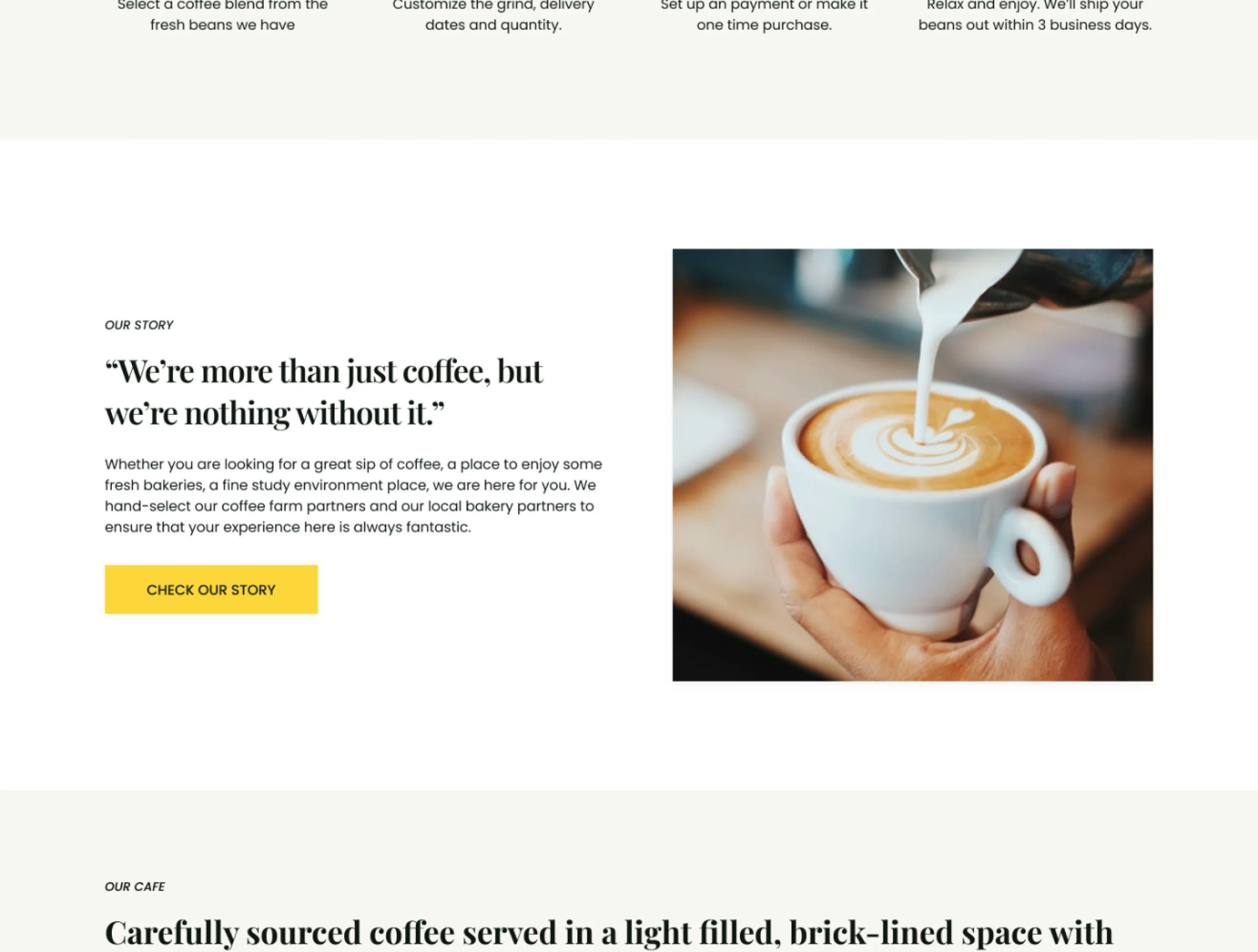
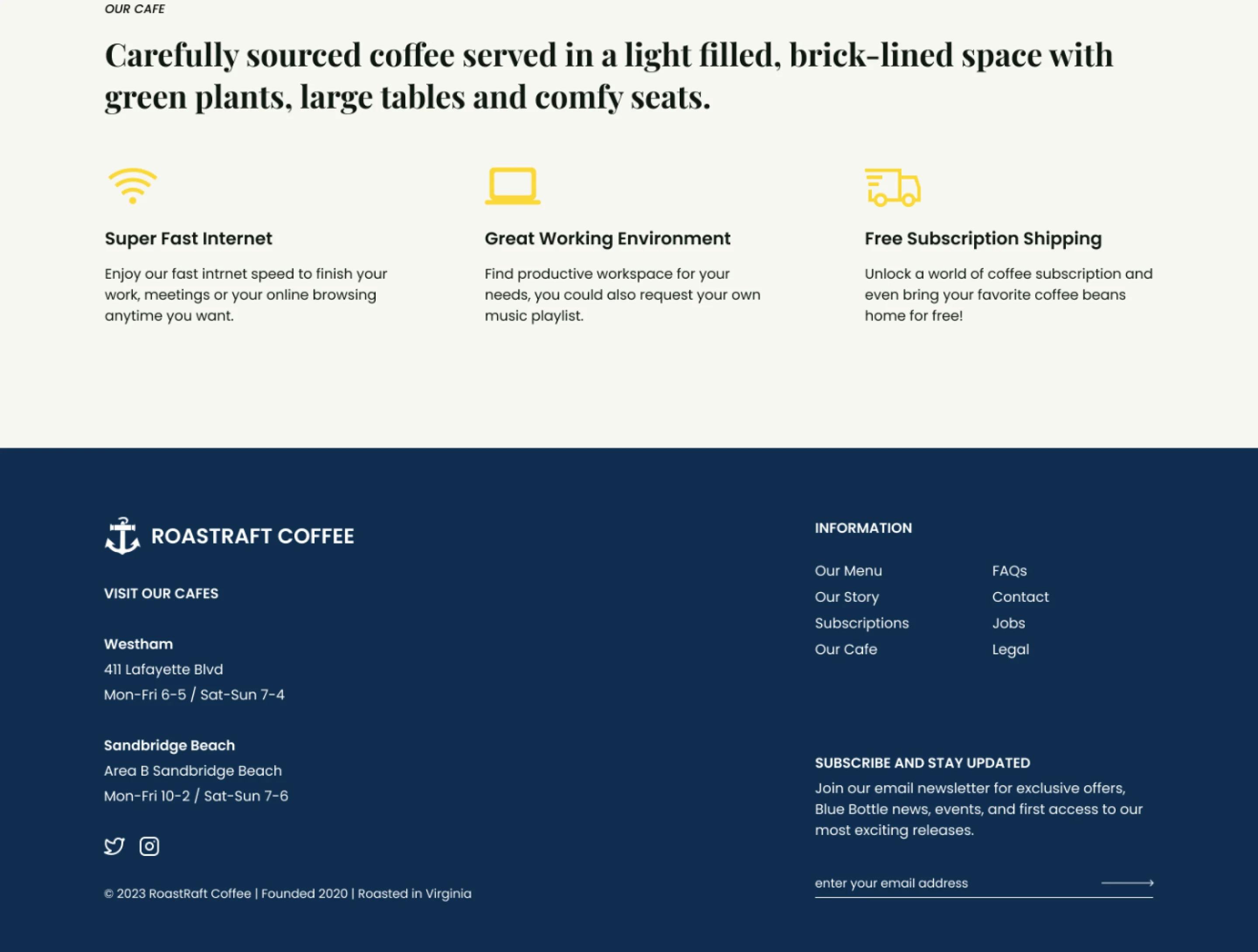
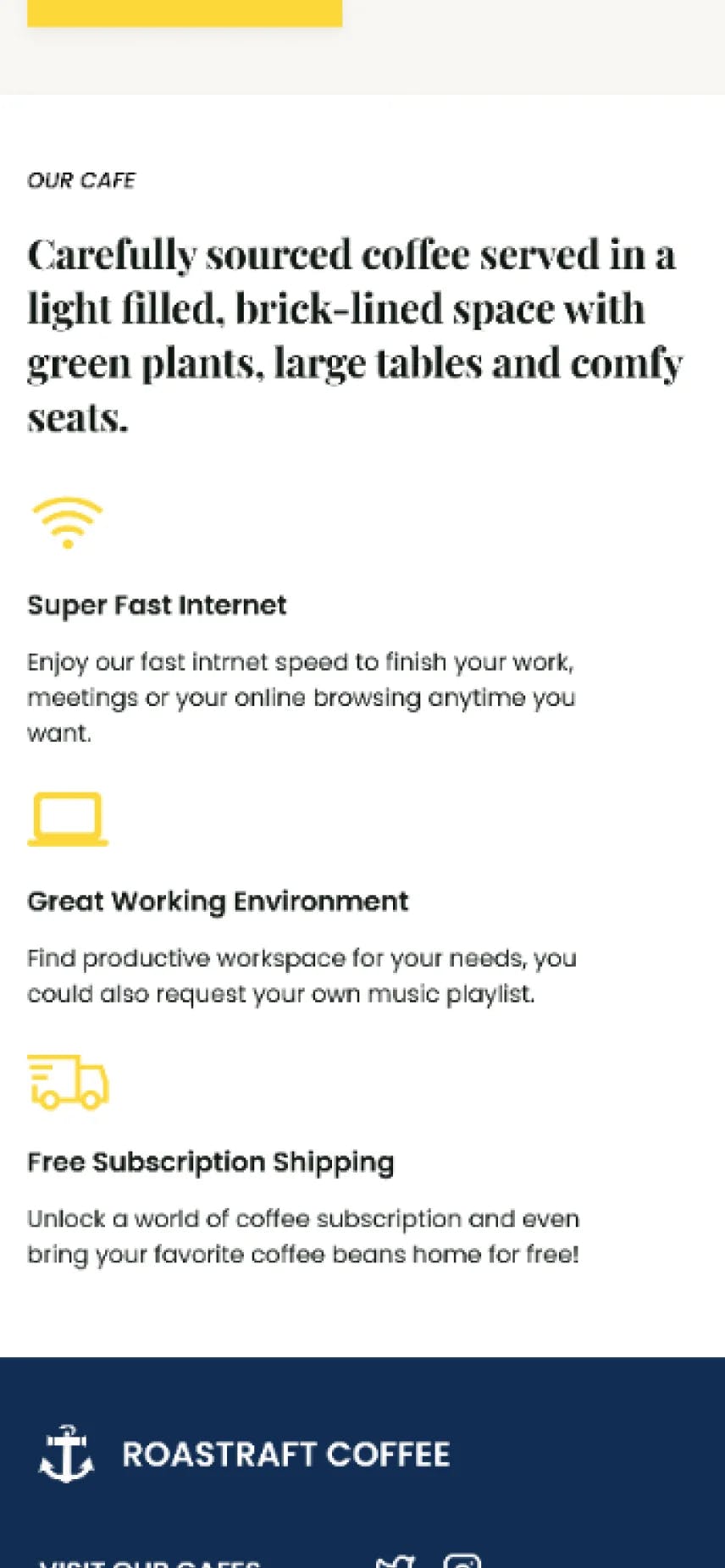
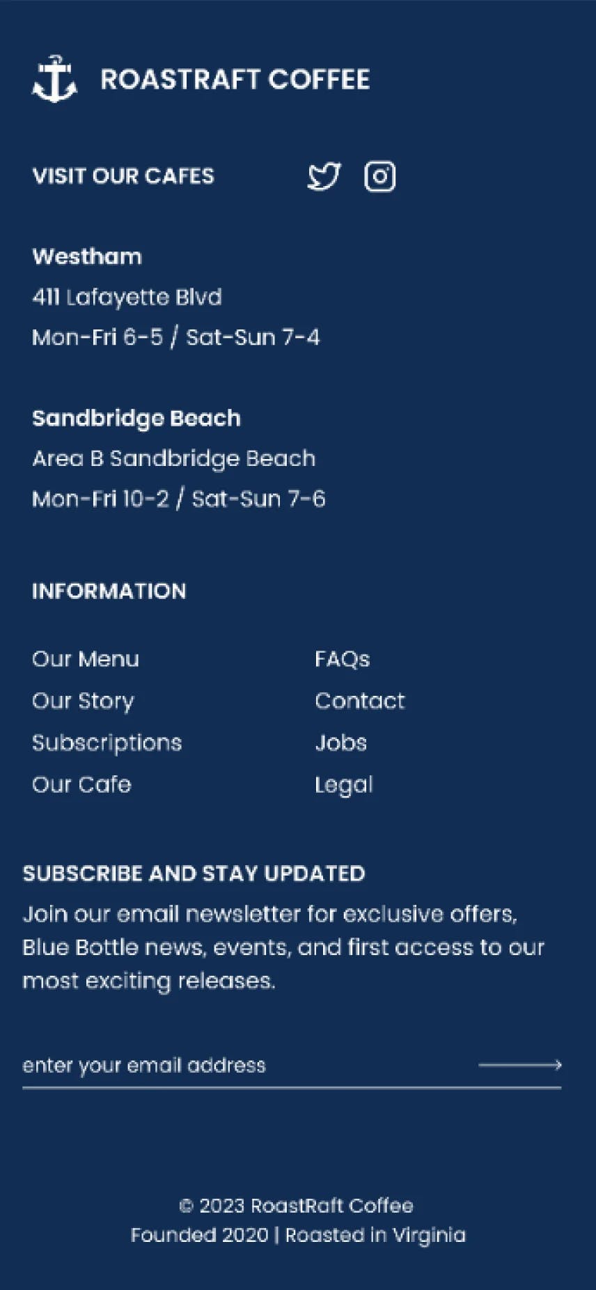
4. Lack of Cafe Information

A significant number of users mentioned that basic information about the coffee shop was often missing or hard to locate. This omission impacts user engagement and trust, aligning with the goal to improve user engagement and loyalty.

From these identified pain points, we formed the following HMW (How Might We) questions:

1. How might we create a user journey that simplifies the exploration, subscription, and ordering processes, irrespective of the device they're using?

This directly ties in with the goal to develop an online platform that's user-centric.

2. How can we ensure Roastraft's website offers a consistent and seamless experience across desktop and mobile platforms?

Given the importance of mobile responsiveness, this question aims to prioritize user experience across all devices.

3. How might we design an intuitive system for users to quickly reorder their favorite coffee without navigating through multiple pages?

Streamlining user actions will directly enhance user engagement and satisfaction.

4. Where and how can we incorporate essential information about Roastraft to ensure users don't miss out on understanding the brand's ethos and offerings?

Giving users a comprehensive understanding of the cafe will foster trust and improve loyalty.

Explorations

We explored three different design templates

Template A

Pros: The coffee shop owner loved the representation of their coffee and ambiance. Some users appreciated the emotional connect the imagery established.
Cons: More than half users found the navigation less intuitive.
Feedback Balance: While the owner was initially inclined towards this due to the brand representation, user feedback about navigational challenges made us reconsider.
Picture of Template A

Template B

Pros: A few users praised the comprehensive details provided. And the owner loves the showcase product section
Cons: The owner felt it didn't capture the cafe's essence, and didn't like the footer. Some users found it text-heavy, want to see more sections with photos.
Feedback Balance: The owner's feedback about missing the cafe's soul and users finding it dense made us seek a middle ground.
Picture of Template B

Template C

Pros: The owner felt this template aligned with the brand while also being functional. Most users found it engaging and intuitive.
Cons: Minor tweaks were suggested to optimize the experience.
Feedback Balance: Given the alignment of both user and stakeholder feedback, this became our preferred choice.
Picture of template C
Decision Process

With the insights from the 10 detailed interviews and active participation from the coffee shop owner, Template C was chosen. It captured Roastraft's essence while being functional and user-friendly.

Mid-fidelity wireframes & Key Solutions
illustration of mid fidelity wireframes
Testing Results

We undertook a comprehensive testing phase with our prototype, choosing a diverse group of 12 users. This group was curated to include both tech-savvy individuals and those less familiar with online shopping, ensuring a wide range of perspectives.

Methodology
Insights

We undertook a comprehensive testing phase with our prototype, choosing a diverse group of 12 users. This group was curated to include both tech-savvy individuals and those less familiar with online shopping, ensuring a wide range of perspectives.

chart/graph of insights
Iterations

Following the feedback, our design went through crucial iterations to better cater to user needs

Picture of iteration screens
Final Design & Prototype
Picture of final screens
Picture of final screens mobile
Style Guide & Deliverables

A comprehensive style guide was prepared, ensuring brand consistency. It highlighted the color palette, typography, iconography, and UI components.

Picture of styleguid
Takeaways & Reflections

This project served as an invaluable lesson in the intricate balance between business objectives, user needs, and design principles. Here are some of the key takeaways and reflections:

  1. Listening Helps: I learned a lot just by listening. Whether it was from the coffee shop owner, potential users, or even team members, their feedback shaped the project.
  2. Working Together Works: I mostly focused on design, but I got a lot of useful information from other team members. They helped me see things I might have missed.
  3. Working Within Limits: The project had its limits, like budget and time. It wasn't easy, but it pushed me to think differently and come up with new solutions.
  4. Redesign and Retry: I didn’t get everything right the first time. I had to change the design a few times based on what I learned from feedback.
  5. Waiting for the Big Day: The website isn't live yet. I'm curious to see how it'll work in the real world. I'll have to wait and see.
* "The Problem" Image by Freepik