Back to Works
CASE STUDY

Kura

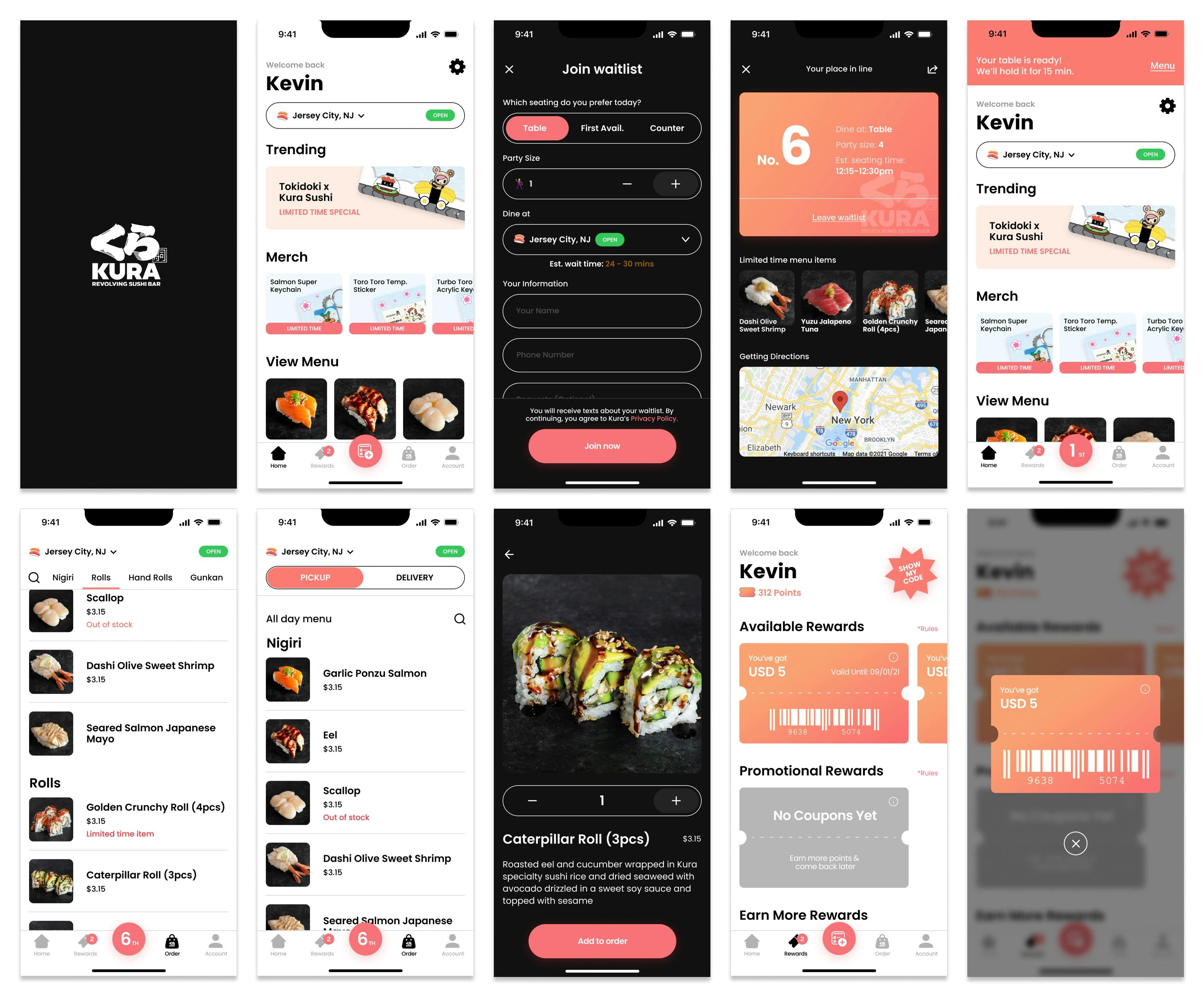
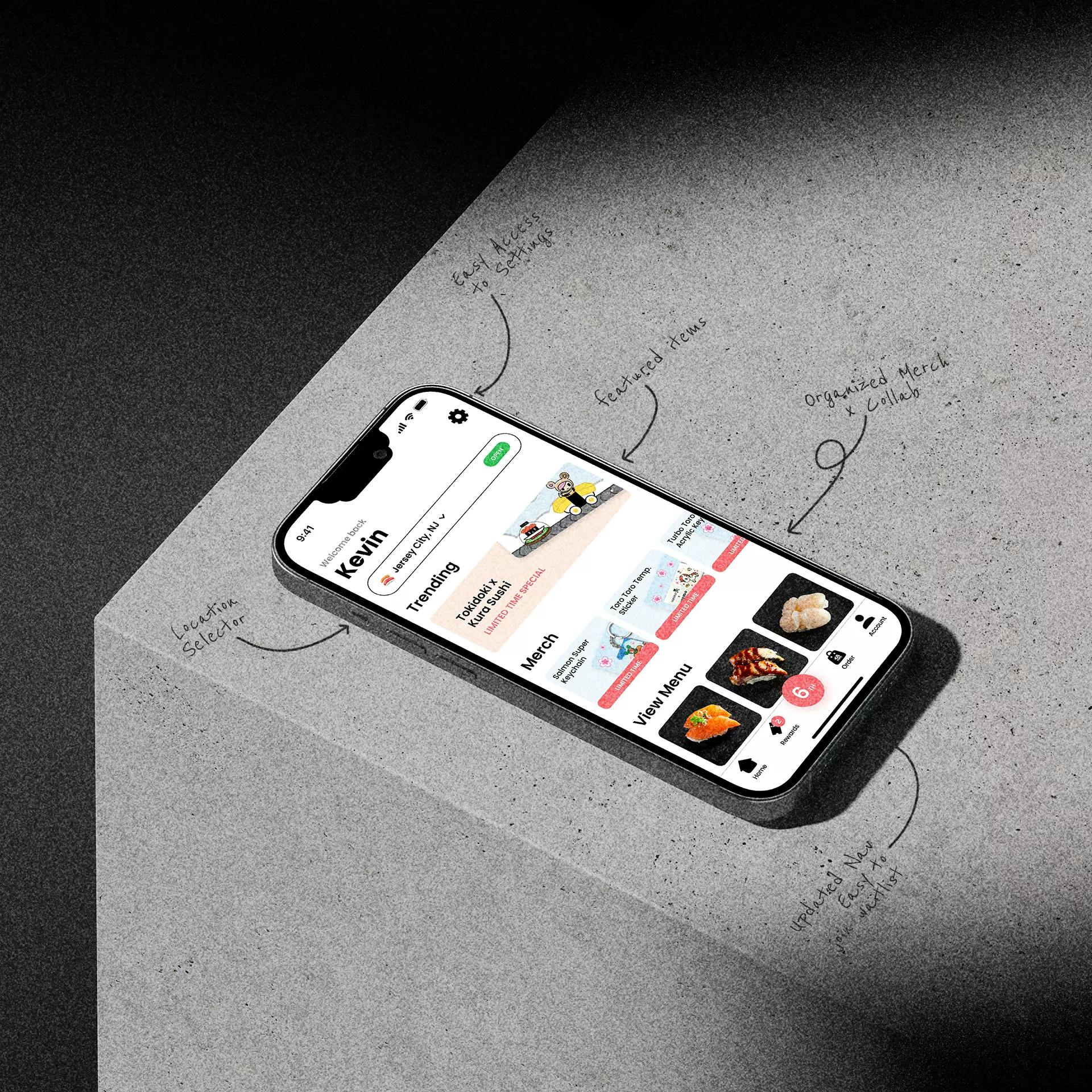
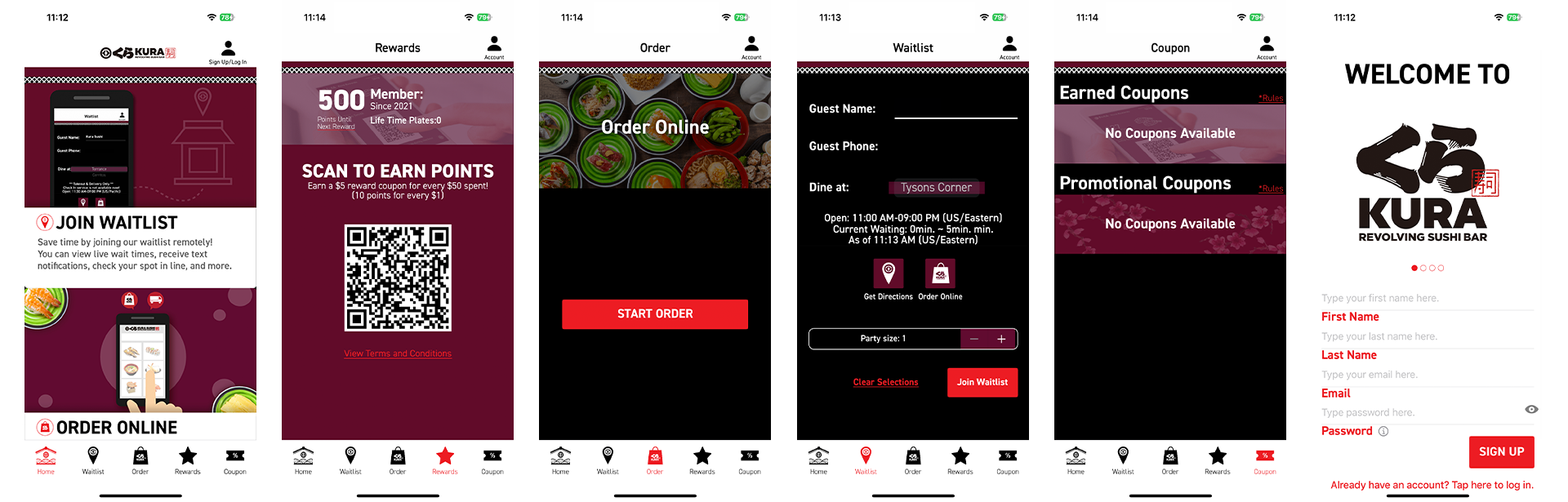
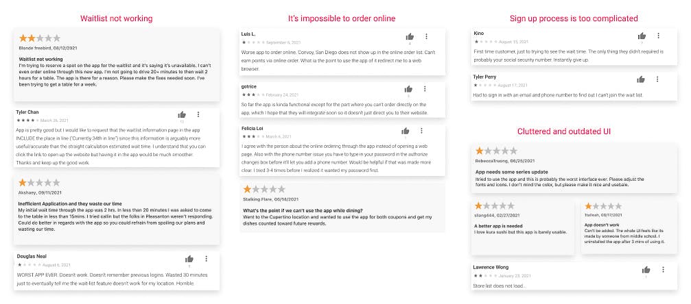
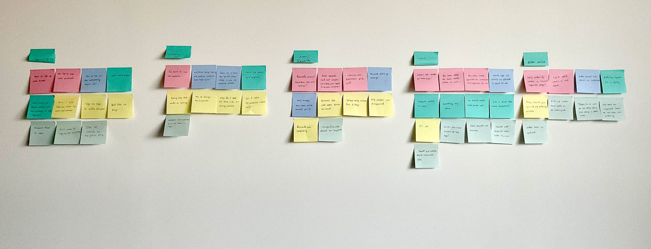
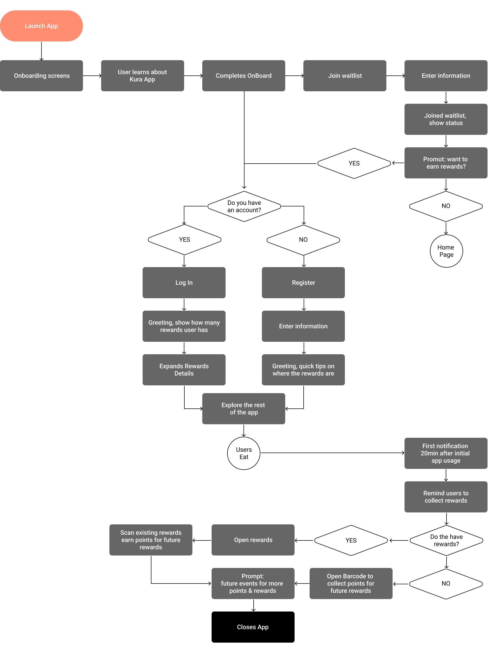
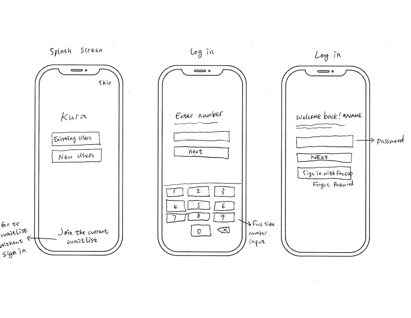
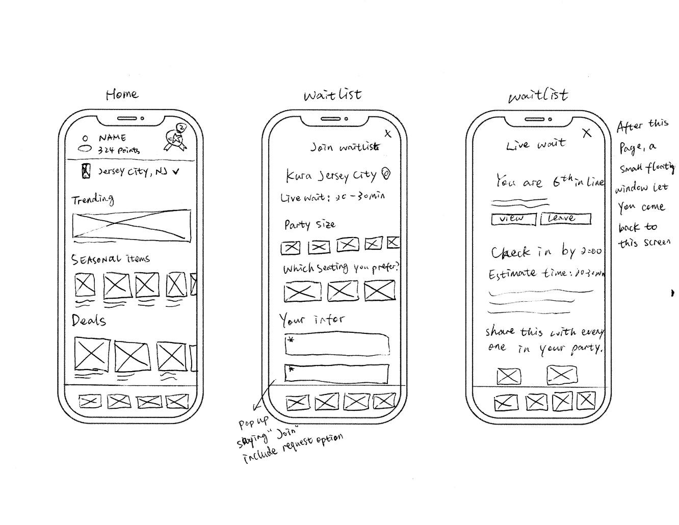
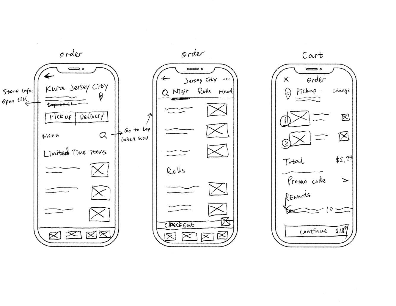
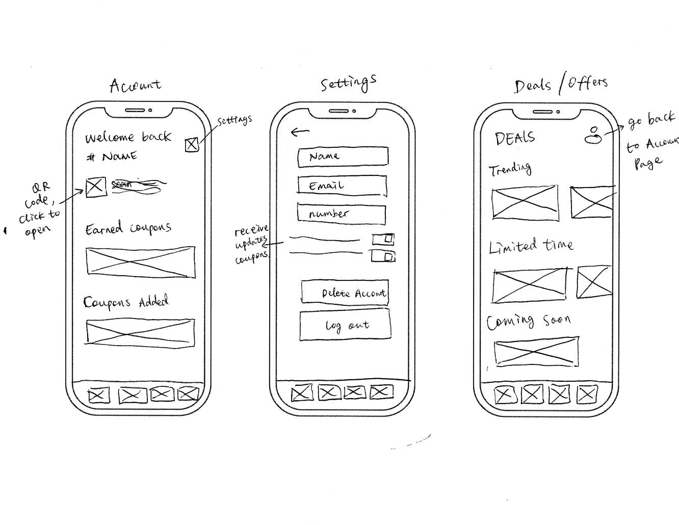
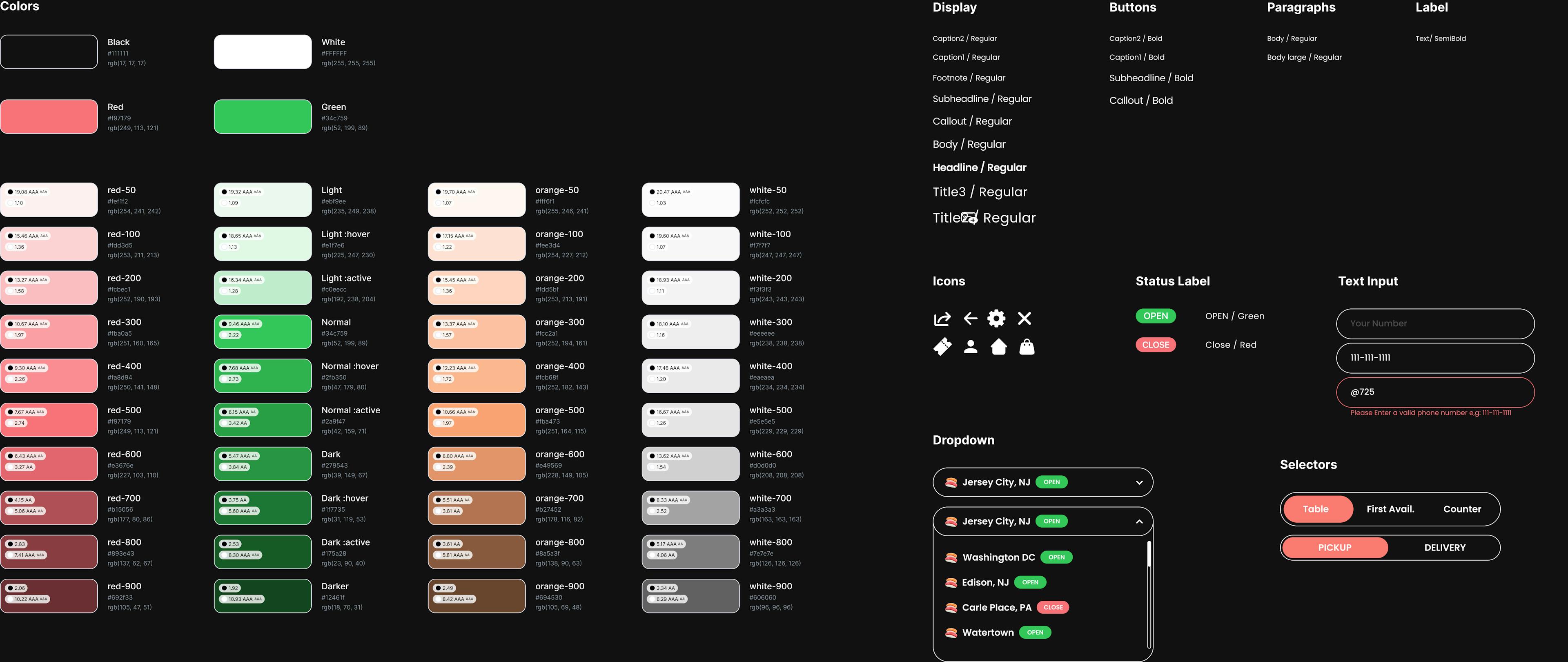
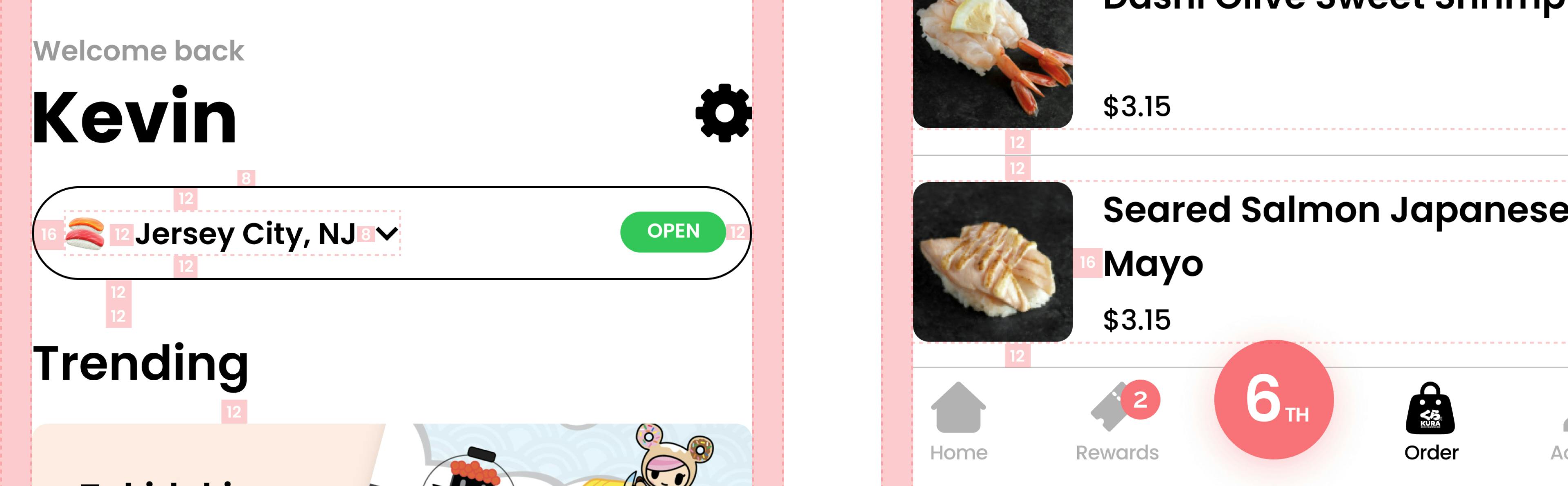
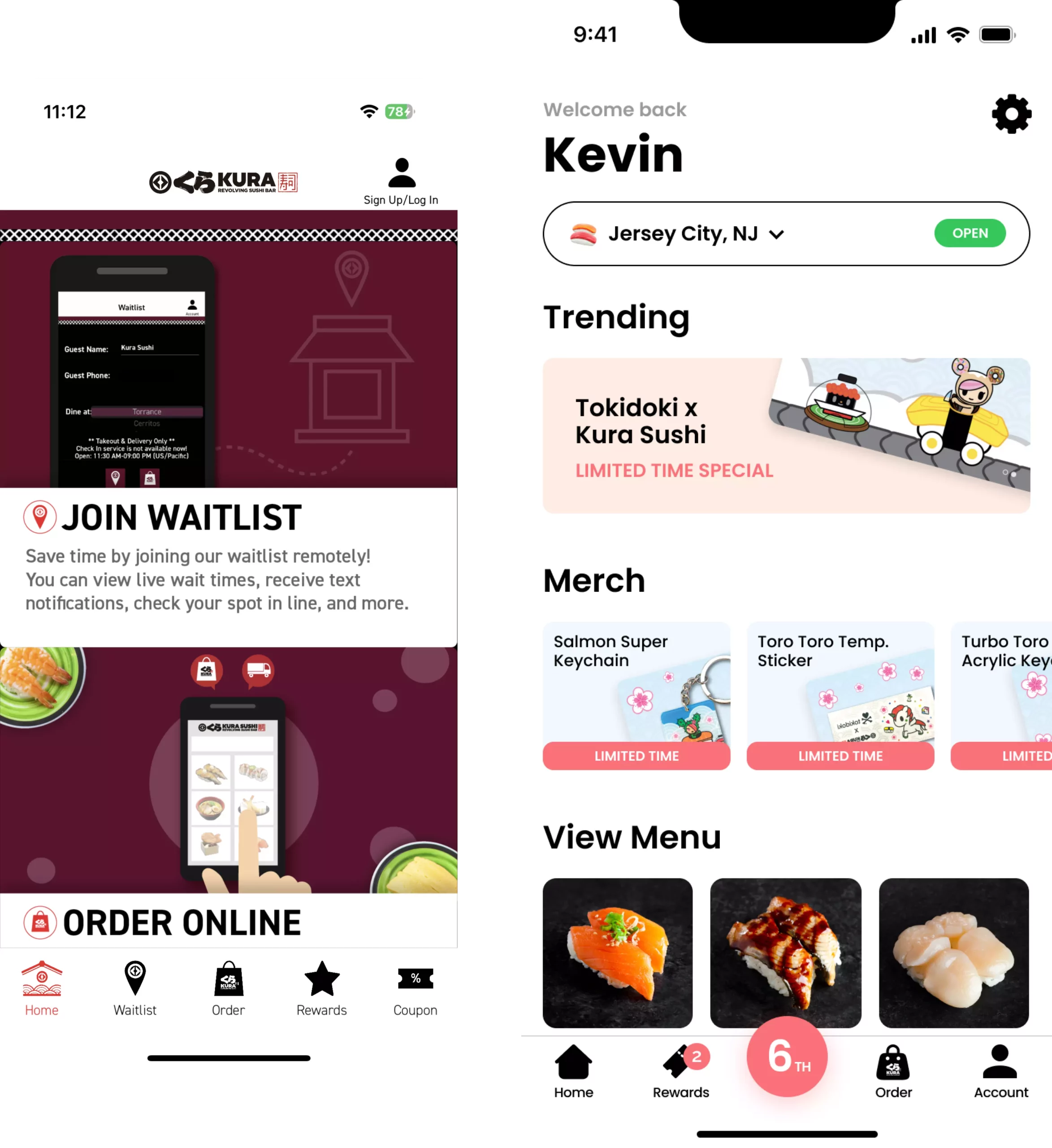
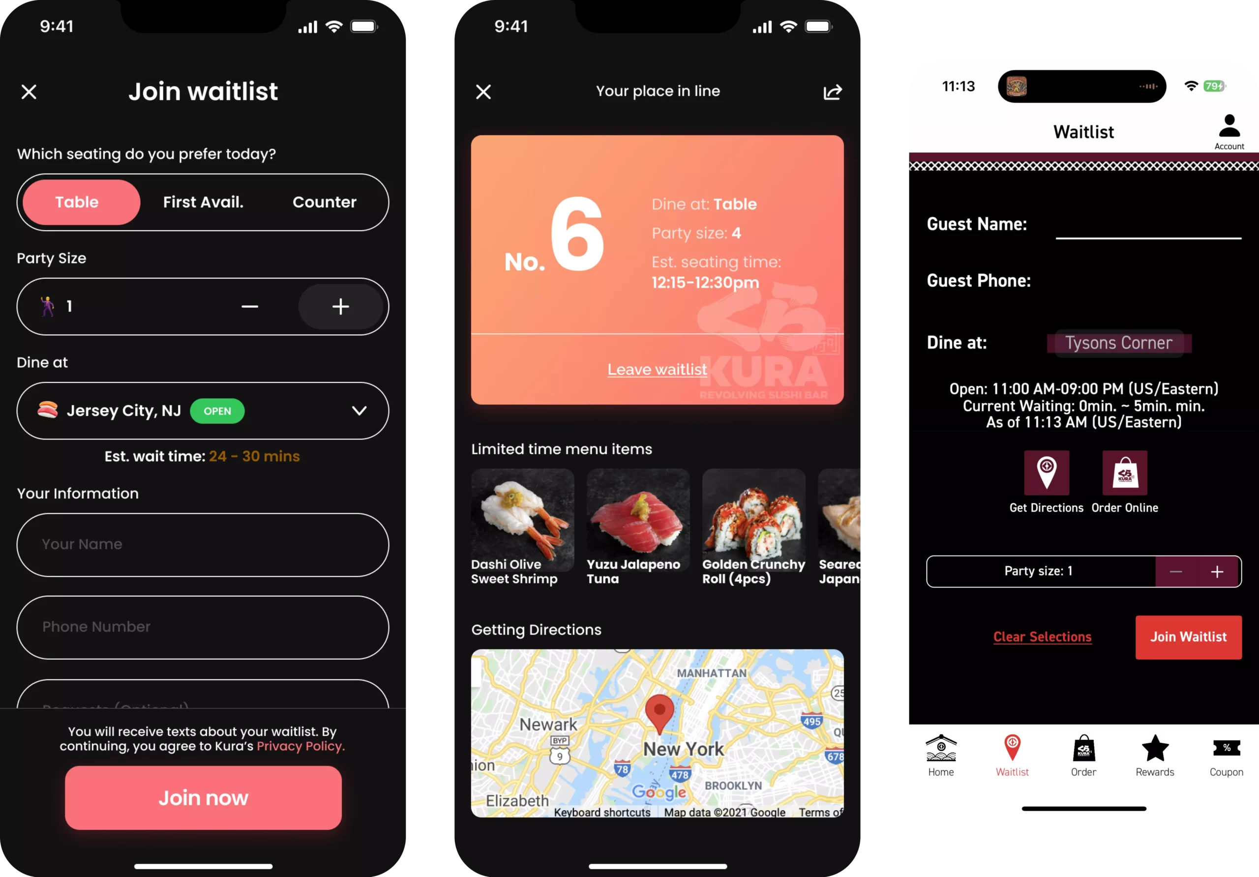
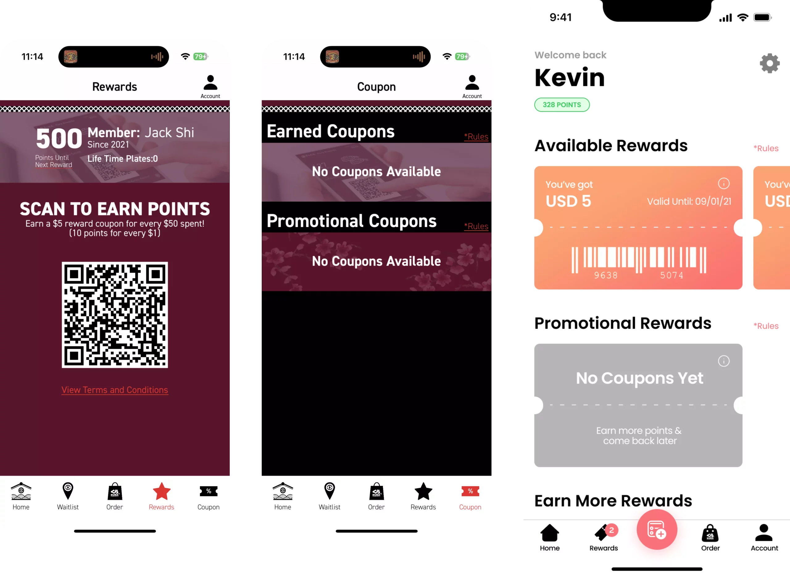
A comprehensive redesign effort was undertaken for the restaurant app, Kura. The goal was to transform the app's user interface into an intuitive and user-friendly platform, elevating the overall experience. Users primarily faced challenges with a clashing color scheme, intricately nested and hidden features, and an excessive number of modals crowding the home screen tab. I built contextualized flows for various scenarios to ensure comprehensive app usage. After several rounds of testing and iterations, we arrived at the app's final look.

Picture of the Yusong Shi
Type
UI / UXMobile Application
Role
Product Designer
What is KURA SUSHI

Kura Sushi offers an interactive menu of 140+ authentic Japanese items through a unique revolving service. Originally from Japan with 35 years of brand history, it's now the largest revolving sushi chain in the U.S., ranking 15th in 2018's Restaurant Business Onlineā€™s growth list.

Picture of the Yusong Shi
Why REDESIGN

Kura Sushi's mobile app, intended to streamline dining experiences, fell short of user expectations. Despite promising features like rewards and waitlist management, its challenging interface and outdated design hindered usability. Recognizing these flaws, I embarked on a redesign to transform it into an intuitive tool for sushi enthusiasts.

Picture of the Yusong Shi
EXISTING APP (PRE-REDESIGN)

The Kura app, reminiscent of older design eras, presented users with a cluttered interface, confusing features, and a dated color scheme. Navigation was daunting, signaling an urgent need for a complete redesign to achieve clarity, appeal, and user-friendliness.

DESIGN GOALS
  • Revamp the interface for intuitiveness and ease of use.
  • Improve the waitlist feature for reduced user frustration.
  • Refine app organization and labeling for clarity.
  • Modernize the app's visual aesthetic to current design standards.
User Problems

In the preliminary phase of my product design case study, I undertook an exhaustive collection of user feedback on the existing application. Recognizing patterns and similarities within the feedback, I systematically synthesized the data into an affinity map. This approach not only grouped related issues for more targeted problem-solving but also provided me with a clearer visualization of overarching themes and pain points experienced by the users. This meticulous research method paved the way for informed design decisions in the subsequent stages.

Picture of the Yusong Shi
How do I solve this?

The research directly informed my design choices. The most pressing issue identified was the app's convoluted user flow and its intricate information architecture. To address this and before I draw out the wireframes, I promptly redesigned the entire user journey map, streamlining the experience and simplifying navigation.

Picture of the Yusong Shi
research Takeaways
User Interface Concerns

A majority of users found the current interface unintuitive and challenging to navigate. Common feedback highlighted difficulties in performing simple tasks, underscoring the need for a more intuitive design that prioritizes user experience.

Waitlist Woes

One of the standout pain points from the feedback was the waitlist feature. Users frequently reported confusion, delays, and a general sense of frustration when trying to add or check their names on the list, emphasizing the necessity for its enhancement.

Organizational Ambiguities

The app's structure was another recurring concern. Users expressed that they often found themselves lost due to unclear labeling and a disorganized layout, stressing the importance of refining the app's organization and clarity of labels.

Outdated Visuals

The visual design of the app was described by many as 'dated' or 'out of touch' with current design standards. The feedback consistently pointed towards a need to modernize the app's aesthetic, making it more appealing and in line with contemporary design trends.

Wireframes

Stepping into the wireframing phase, I embarked on translating the research insights into a tangible form. This low-fidelity representation would ensure an enhanced and intuitive user flow, rectifying the structural and navigational complexities highlighted during the research. By establishing this foundational structure, the stage was set to ensure the interface's intuitiveness and clarity, directly addressing users' pain points.

Picture of the Yusong Shi
Design System

The Kura app, reminiscent of older design eras, presented users with a cluttered interface, confusing features, and a dated color scheme. Navigation was daunting, signaling an urgent need for a complete redesign to achieve clarity, appeal, and user-friendliness.

Picture of the Yusong Shi
Layout & Spacing

Ultimately, the new design pull inspiration from Material Design and Fluent IOS for it's layout and spacing. Fluent UI Design system was closely studied and then adapted to the needs of Kura redesign.

Columns: 4 Gutter: 16Margin: 16
Picture of the Yusong Shi
Mobil Screens
Picture of the Yusong Shi

After thorough research, meticulous wireframing, and the creation of design systems, I have carefully crafted a seamless and user-centric experience. Here are some of the key enhancements

A Revitalized Home Page

The Kura app's home page has transformed for better usability and engagement. Users now immediately access settings upon login for a personalized experience. Integrated location and store info offer quick context. This layout includes trending items, merchandise, and menus with horizontal scrolls for organized content. 'Rewards' and 'coupons' merged, streamlining the user journey. The 'join waitlist' stands out on the navbar for instant access.

Picture of the Yusong Shi
Streamlined Wailist Experience

A dropdown menu simplifies location selection and boosts interactivity. A prominent Call-To-Action encourages users to join the waitlist when ready. Followed by a status screen provides transparency on wait time, enhancing control. The page also promotes limited-time menu items, while a unified color palette and visuals ensure a clutter-free, appealing look.

Picture of the Yusong Shi
Simplified Rewards Experience

Rewards & Coupons pages now unite into an intuitive 'Rewards' section. I eliminated the two-step scanning process by placing the barcode in the top-right corner, accessible with a single click for a smooth experience. This design not only reduces steps but also enhances aesthetics.

Picture of the Yusong Shi
THINGS I'VE LEARNED / TAKEAWAYS

The exhilarating redesign journey honed my design skills, revealing how even the smallest details shape user experiences. Learning that taking adventage of research findings is a great way to strengthen my design decisions. When playing with limited data, going back to design basic, using visual design fundamentals, design principles, usability heuristics and familier patterns or existing systems is a great way to design product as well. This evolving case study will continue with revisions, usability enhancements, and ongoing design exploration.